I really wanted to make some notecard sets of my "30 Days" and "28 Years" colored pencil drawings, to sell on Etsy and at the Paint Creek Center for the Arts in Rochester, Michigan (where many notecard prints of other colored pencil drawings and paintings I've completed are already for sale). My vision was to have a notecard of the entire drawing and then several close-up details of the flowers, available in box sets. I figured it wouldn't be too hard, since I've done notecards like this before. Unfortunately, I was wrong.
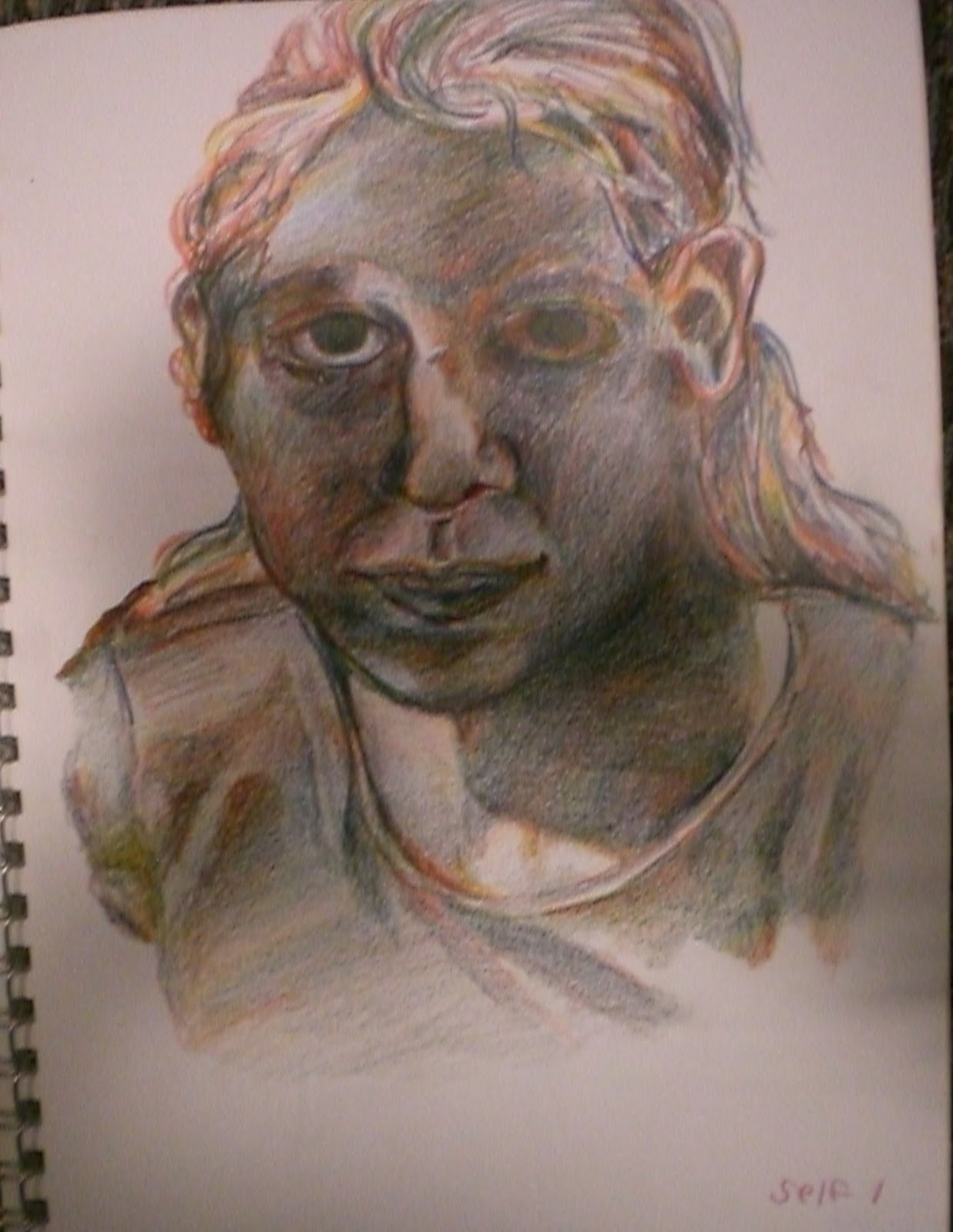
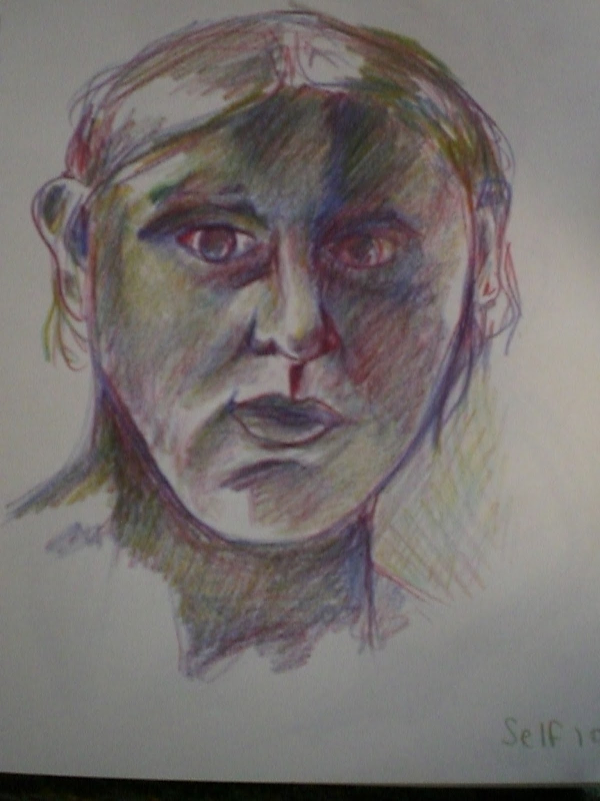
The problem is the size of the drawings. Each one is 22"x30", which is too large to scan all at once on the size scanner I have at home (which can only go up to 11"x17" size). I have made notecards of watercolors this size before, but I didn't scan the artwork - I took a picture of it with a camera. When I tried to do this these drawings, however, the pictures were not a great quality for printing. For starters, the only camera I have right now is the one on my cell phone. Usually my cell phone takes pretty good pictures, but because of the texture of the colored pencil and the detail in these drawings, I just couldn't get one I was happy with that didn't look either blurry or pixelated when I printed them out. I also tried to scan the artwork in four different 11x15 quadrants (top-right, top-left, bottom-right, and bottom-left), so I could at least get some good detail shots - but this also didn't work out as I'd hoped. I don't know if the problem is the colored pencil itself, the texture of the paper, or the fixative I sprayed over the final drawings, to prevent the colored pencil from rubbing off as I move it around and store it - but even the scans had trouble getting good quality images. Everything ended up out of focus, or still ended up pixelated when I printed them out.
I spent about two days on this. The first day, taking photos with my cell phone and trying to make those work. Then, more recently, I spent another day scanning them, cropping them down to the detail shots I wanted to use, and printing some out. Both times, I ended up wasting some of my notecard paper on images that were too pixelated to sell. It was more than a little frustrating.
I don't want to say I'm giving up, because I still would like to have notecard sets of those two drawings available sometime in the future, as well as for my "Race Bouquet (Stronger Together)" drawing, and the other drawings I'll be doing in that series - but I am putting this on the back burner for now. I would rather spend my time right now making artwork than figuring out how to make my own prints of them; once I finish my "stronger together" series I should have more time to revisit this problem and think of a better solution. Maybe the answer is getting a better digital camera, and getting some good photos of the entire drawing (and completely scraping the idea of also doing "detail" shots on notecards). Or maybe the answer is to send my artwork out somewhere to have it professionally scanned and made into high-quality prints (higher quality than I can print at home anyway). Maybe there's even some middle ground there, where I can find a printing service that has a scanbed large enough for 22"x30" paper, which can scan my artwork for me.
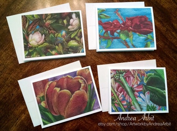
In any case, as much as I would like to say I have some new designs available as notecard sets, that's simply not the truth. I do, however, have many other colored pencil drawings, acrylic paintings, and watercolors available as notecard art prints. I recently restocked my notecards at PCCA in Rochester, MI, and I also have all notecards available through my Etsy shop. These make great gifts (and Mother's Day is just around the corner)!
The problem is the size of the drawings. Each one is 22"x30", which is too large to scan all at once on the size scanner I have at home (which can only go up to 11"x17" size). I have made notecards of watercolors this size before, but I didn't scan the artwork - I took a picture of it with a camera. When I tried to do this these drawings, however, the pictures were not a great quality for printing. For starters, the only camera I have right now is the one on my cell phone. Usually my cell phone takes pretty good pictures, but because of the texture of the colored pencil and the detail in these drawings, I just couldn't get one I was happy with that didn't look either blurry or pixelated when I printed them out. I also tried to scan the artwork in four different 11x15 quadrants (top-right, top-left, bottom-right, and bottom-left), so I could at least get some good detail shots - but this also didn't work out as I'd hoped. I don't know if the problem is the colored pencil itself, the texture of the paper, or the fixative I sprayed over the final drawings, to prevent the colored pencil from rubbing off as I move it around and store it - but even the scans had trouble getting good quality images. Everything ended up out of focus, or still ended up pixelated when I printed them out.
I spent about two days on this. The first day, taking photos with my cell phone and trying to make those work. Then, more recently, I spent another day scanning them, cropping them down to the detail shots I wanted to use, and printing some out. Both times, I ended up wasting some of my notecard paper on images that were too pixelated to sell. It was more than a little frustrating.
I don't want to say I'm giving up, because I still would like to have notecard sets of those two drawings available sometime in the future, as well as for my "Race Bouquet (Stronger Together)" drawing, and the other drawings I'll be doing in that series - but I am putting this on the back burner for now. I would rather spend my time right now making artwork than figuring out how to make my own prints of them; once I finish my "stronger together" series I should have more time to revisit this problem and think of a better solution. Maybe the answer is getting a better digital camera, and getting some good photos of the entire drawing (and completely scraping the idea of also doing "detail" shots on notecards). Or maybe the answer is to send my artwork out somewhere to have it professionally scanned and made into high-quality prints (higher quality than I can print at home anyway). Maybe there's even some middle ground there, where I can find a printing service that has a scanbed large enough for 22"x30" paper, which can scan my artwork for me.
In any case, as much as I would like to say I have some new designs available as notecard sets, that's simply not the truth. I do, however, have many other colored pencil drawings, acrylic paintings, and watercolors available as notecard art prints. I recently restocked my notecards at PCCA in Rochester, MI, and I also have all notecards available through my Etsy shop. These make great gifts (and Mother's Day is just around the corner)!