Sunday, April 30, 2017

"Race Bouquet (Stronger Together)" - Finished

My latest 19"x25" colored pencil drawing is now complete! Titled, "Race Bouquet (Stronger Together)," it is part of a series of six planned drawings of bouquets that showcase the richness and beauty that can come from a variety of plants, representing humans of different subgroups under a broad category. "Race Bouquet" uses a wide range of flowers available in "skin tone shades" to demonstrate different races of people living and working side by side, in harmony, to create a beautiful, multicultural community.

Here is the completed drawing, along with the 31 colored pencils I used:


Here are some detail pics of the bouquet:


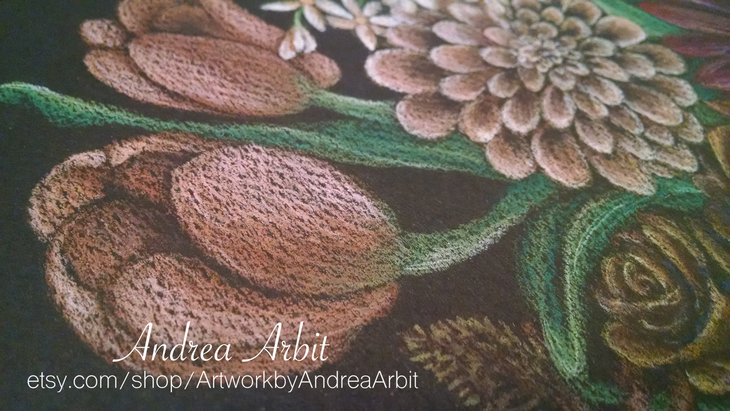
And some extreme close-up shots, showing the texture of the paper through the colored pencil:


This is not yet available for sale, but I will probably list it (and the others to-come in this series) in my Etsy shop at the end of the year.

-

To read more about the meaning behind this drawing or the specific symbolism of each flower, visit this blog post.

To see "the making of" photos of this drawing, visit these other blog posts:

  • Preliminary sketches ("In Progress 1")
  • Drawing and lightly coloring in the first 12 flowers ("In Progress 2")
  • Drawing and lightly coloring in the last 12 flowers ("In Progress 3")
  • Adding detail and dimension to the astilbe, cattail, gladiolus, protea, freesia, and amaranthus plants ("In Progress 4")
  • Adding detail and dimension to the gerbera daisy, jasmine, ti leaf, carnations, peony, and chrysanthemums ("In Progress 5")
  • Adding detail and dimension to the tulips, dahlia, orchids, roses, chocolate sunflower, and succulent ("In Progress 6")
  • Adding detail and dimension to the peruvian lilies, coneflowers, asters, hibiscus, lotus, and cherry blossoms ("In Progress 7")


Saturday, April 29, 2017

"Race Bouquet (Stronger Together)" - In Progress 7

To read about the meaning behind this drawing or the specific symbolism of each flower, visit this blog post.

-

Today I'll show the last few step-by-step process photos for completing this 19"x25" drawing, "Race Bouquet (Stronger Together)."

The peruvian lily was a fun plant to work on, because it had some interesting colors and details. I used red, orange, pink, yellow-orange, white, and black for the petals (black for the centers and for the spots present on the lighter, yellow-ish petals), and three shades of green for the leaves and stems.


Hopping back over to the left side of the bouquet, I next worked on the coneflowers. These were difficult, in that coneflowers are typically brighter in color, with yellow or purple petals. The cone-shaped centers are really the part of the plant that best mimic skin tone, and therefore they were the part that I wanted to play up the most. For those coneflowers that I did give thin petals to, I tried to keep the petals small and close to the color of the cone-like centers, even if that wasn't perhaps the most biologically realistic choice.

Another issue was getting the coneflowers light enough to be distinguishable from the black paper background, while also keep them fairly dark. For other dark plants, I tried to keep them toward the center of the bouquet so that wouldn't be as much of a problem - but it wasn't realistic to have all of the darker flowers in the center, so some of them had to be towards the outside, touching the black background.

I used dark brown, medium brown, black, white, two shades of dark yellow/yellow-orange, and two shades of pink for the flowers. The stems and leaves added another two colors with two different shades of green.


Next I did the small trio of brown asters. Again, these are often brighter colors in nature, including their most well-known color - purple. To keep them closer to skin tone pigments, I made these particular asters browner. The petals are made up of dark brown, medium brown, "pumpkin orange" and light tan for the highlights, with yellow/pale yellow centers. The stems were made with two shades of green.


Next, I worked on the brown hibiscus flower. This was another dark bloom that would be at the edge of the bouquet, so I compromised by making the edges of the petals much lighter, to define the edges of the hibiscus against the black paper, while keeping the shadows as dark as possible.

I used pale pink for the highlights, red, yellow/orange, and pale yellow for the center and the flower's stamen, and two shades of brown, a darker yellow-tan, and black for the shadows. The leaves were done with two shades of green.


Going back to the right side of the bouquet, there are only two flowers left! For the second to last flower, the lotus, I used an undertone of light green, pale yellow, and gray, which I then blended over with two shades of pink, two shades of brown, and three shades of yellow/yellow-orange. I went over the center with yellow, added the dots to the center with dark brown, and added a bit of pure white for the highlights.


Instead of jumping right into the last flower, at this point I stopped to work on the vase a little. I added some more reflections with white colored pencil, added a bit of color to show some of the flowers that might be reflected in the glass vase, and added quite a few stems and leaves - though subtly, so they wouldn't be 100% visible. In a real glass vase, the stems might fade into the black background a bit, so that's what I tried to do here, too - especially since I wanted the focus to be not on the vase, but the flowers above it.


Finally, I tackled the branch of cherry blossoms, using white, pale peach, peach, two shades of pink, dark red, dark brown, and black. The branch was done in brown, while the black pencil was used to help define some of the ultra-white tiny stamen rising from the centers of the cherry blossoms.

I also colored in the large leaf next to the lotus plant, using three shades of green, blue, and a dark yellow colored pencil.


And now my drawing is complete! Check back tomorrow from some final photos of the entire drawing together.

Friday, April 28, 2017

"Race Bouquet (Stronger Together)" - In Progress 6

To read about the meaning behind this drawing or the specific symbolism of each flower, visit this blog post.

-

The first half of my "Race Bouquet (Stronger Together)" colored pencil drawing is complete. Now, on to adding dimension and detail to the next six flowers in the bouquet!

These two tulips on the left side of the bouquet were drawn by blending peach, red, dark red, brown, and black, while the stems and leaves were created with three shades of green.


Next to the tulips is a little dahlia bloom. I used a light tan pencil for the highlights, a dark brown and medium brown for the shadows, and peach and dark yellow for the in-between areas, blending the light and dark together.


On the other side of the bouquet, I added color and detail to these two orchid blossoms. The outer petals used light green, white, and dark yellow, while the insides of the orchids used two shades of red, pink, and white. For the orchid stems I used the same light yellow-green I used in the petals, along with a medium green shade.


I took some liberties with the coloring of the chocolate sunflower in the center of the bouquet. I wanted it to be lighter in color than the ti leaf it was right next to - so the two flowers wouldn't blend together too much - but also still fairly dark, which left me with the same problem I had in coloring the ti leaf. Because I was drawing on black paper, it was difficult to use dark colors without them simply looking like the background. I used some black pencil, along with dark purple, blue, and brown, to blend the shadowy center of the sunflower. The lighter parts of the petals were drawn with red and orange pencils. The stem was done in green.

I understand blue and purple aren't in themselves skin tones we see on humans - but skin can actually look blue and purple under certain lighting conditions. Shadows are not just black - if you look closely at shadows, you can see shades of blue or purple (or other colors). Furthermore, dark skin tones can certainly have what appears to be a beautiful purple or blueish undertone; even my very pale skin sometimes looks a little blue, due to the veins visible underneath my skin. So while it seems like a strange choice for a skin-tone themed bouquet, blue and purple are actually quite within the realm of possibility for how skin can naturally look - to say nothing of eyelids, cheeks, or lips enhanced with makeup.


For these two roses, I used yellow undertones, light tan and cream highlights along the edges of the petals, and "pumpkin orange" and a dark brown pencil to blend into the black paper for the darker shadows where the petals touch.


Next, I worked on the "hen and chicks" succulent (though this particular plant is only one individual, so I guess it's just a "hen" without her "chicks"). These are often more blue or green when found in nature, but to mimic skin tones, I stuck to pinks, browns, and yellows instead.


Just six more flowers to go, and then this 19"x25" drawing will already be complete!