Showing posts with label lavender. Show all posts

Tuesday, May 30, 2017

"Gender Bouquet (Stronger Together)" - Finished

I'm all finished with my latest 19"x25" colored pencil drawing. Part of my "Stronger Together" series, this drawing uses color to represent all genders - from pink to blue and all of the purples in between. Gender is indeed a spectrum, and there are so many ways to express ourselves and our genders. Why not celebrate them all?

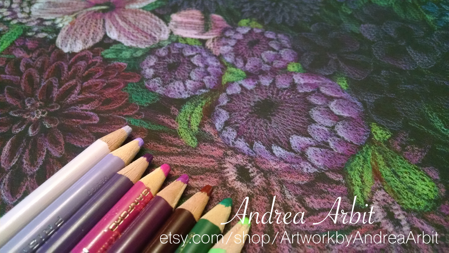
Below are some photos of the complete drawing, along with the 30 colored pencils I used. My materials were Canson MiTeintes black paper and Prismacolor brand colored pencils.


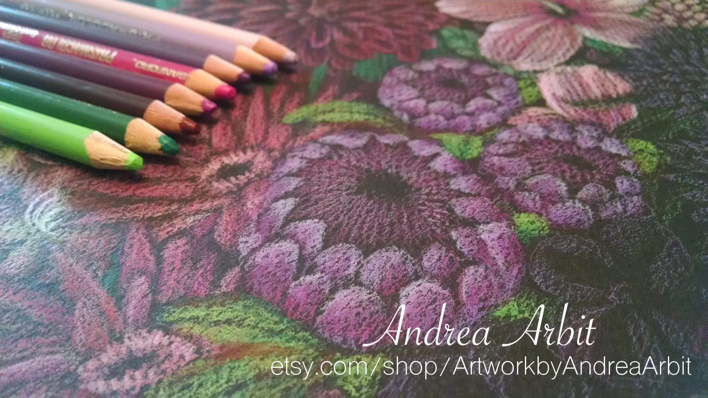
And here are some detail shots of the bouquet drawing:


This is not yet available for sale, but I will probably list it (and the others to-come in this series) in my Etsy shop at the end of the year.

-

To read about gender terminology and why gender is a spectrum, visit this blog post. To read about the idea behind this colored pencil drawing and an explanation for the symbolism of the specific flowers used, check out this one.

To see "the making of" photos of this drawing, visit these other blog posts:
  • Preliminary sketches ("In Progress 1")
  • Drawing and lightly coloring in the first 12 flowers ("In Progress 2")
  • Drawing and lightly coloring in the last 12 flowers ("In Progress 3")
  • Adding detail and dimension to the hollyhock, geraniums, lupine, hibiscus, snapdragon, and dahlia ("In Progress 4")
  • Adding detail and dimension to the gerbera daisy, amaryllis, peony, protea, chrysanthemums, and lavender ("In Progress 5")
  • Adding detail and dimension to the iris, pansies, carnations, African violets, lithodora, and sweet pea ("In Progress 6")
  • Adding detail and dimension to the azalea, anemone, hydrangea, cornflowers, lotus, and delphinium ("In Progress 7")

Wednesday, May 24, 2017

"Gender Bouquet (Stronger Together)" - In Progress 5

To read about gender terminology and why gender is a spectrum, visit this blog post. To read about the idea behind this colored pencil drawing and an explanation for the symbolism of the specific flowers used, check out this one.

-

The next six flowers I worked on for this drawing were the last two pink flowers, and half of the purple flowers.

This pair of pink gerbera daisies was the seventh plant I colored in. I used four shades of pink to do the job.


Next I colored in the pink amaryllis petals with two tints of light pink, a reddish pink pencil, a dark red, and white. For the stems and leaves, I used two shades of green.


Here is the completed pink side of the bouquet! Now, on to the purple flowers!


I did a large peony bloom in a pinkish purple to transition between the two colors. I used three shades of green for the leaves and white, three shades of purple, two shades of pink/red-violet, and a dark red pencil for the petals.


The protea flowers are similarly colored. I used three shades of purple, magenta, red-violet, dark red, and two shades of green.


Next, I worked on the light purple flowers. These little chrysanthemum plants have white and four shades of purple on their teeny tiny petals.


This lavender springs use the same four shades of purple and white - plus three shades of green for the stems and leaves.


And now I'm at the halfway point! Twelve flowers are done; twelve more to go to finish off this colored pencil bouquet!

Thursday, May 18, 2017

"Gender Bouquet (Stronger Together)" - In Progress 2

To read about gender terminology and why gender is a spectrum, visit this blog post. To read about the idea behind this colored pencil drawing and an explanation for the symbolism of the specific flowers used, check out this one.

-

Once I completed my research, decided on which flowers to use, and came up with a plan for the composition of the bouquet, I moved on to the black paper and began drawing. I used Prismacolor brand pencils and Canson Mi-Teintes paper, size 19x25 inches.

I started by sketching in the purple chrysanthemums and lavender sprigs in the center of the bouquet.


Then I drew in the iris and pansies, to create a vertical line of purple flowers down the center of the bouquet. The chrysanthemum and lavender will be pale purple, while the iris and pansies will be darker.


I next added the two pinkish purple flowers to the left - a large peony bloom, and a trio of protea flowers.


To the right of those first purple flowers, I drew the two blueish-purple plants - African violet and a small bunch of carnations.


I added in the pale pink flowers next - lupine and hibiscus.


Below them, I sketched in two gerbera daisies and amaryllis flowers.


These are the first dozen flowers. My next post will show how I sketched in the last dozen (the remaining four pink flowers, as well as the eight blue flowers). After the entire composition is lightly sketched in, I will go back over with more layers of color, building up dimension and detail to make these plants vibrant against the black paper.

Wednesday, March 29, 2017

"28 Years" - Year #26

For general information about this 22"x30" colored pencil drawing, see this blog post.
For more information about the flower symbolism I used (Years 15-28) and life events that led me to select those particular flowers, see this blog post.

--

My 26th year is depicted with symbols of lettuce and lavender.
  • Lettuce: symbol of never giving up
  • Lavender: symbol of purity, silence, caution, serenity, calmness, devotion, virtue, wishes coming true, grown-up femininity, refinement, grace, elegance, delicateness, and preciousness
First, I drew outlines of the plants on black paper:


These are the two botanical illustrations I looked at for reference while I drew (I do not own these images; I found them on Google):


Once I had the outlines in place, I started lightly sketching in the plants, beginning with the sprigs of lavender.


I added more color and detail to the lettuce in the background first, since I knew it would take more time. It was hard to add too much detail to the curling leaves, since the lavender was in front of it compositionally.


Then I colored in the lavender. I ended up making it a little lighter in color than I'd initially planned, so that it would be differentiable enough from the background lettuce. When it was just purple/blue without the white highlights, it blended in too much with the red shades of the red leaf lettuce.


Here is the whole drawing so far. Just two more sections to go - my 27th and 28th years!