To read about the meaning behind this drawing or the specific symbolism of each flower, visit this blog post.
-


After the daisy, I moved on to the sprig of jasmine blooms. In nature, these jasmine would be almost pure white, with just a hint of yellow - but because I want these flowers to mimic skin tones found throughout the U.S., I made them a little darker, with a bit more tan coloring. I used white, pale peach, two shades of orange, a dark yellow, cream and pale yellow, and two shades of green for the stem.


The chocolate ti leaf in the center of the bouquet was a bit of a challenge. I wanted to give it the same attention I gave the lighter colored flowers, but the more detail I added, the lighter it got - and I also didn't want to lighten it too much from the black paper background, since this chocolate ti leaf is the darkest plant in my bouquet. I settled for adding some dimensionality with dark browns, dark reds, and dark purples, and giving just the faintest bit of highlights in pink or gray along some of the edges of the ti leaf, to define it. The base of the ti leaf has a bit of green, to mimic the ti leaf's coloring in nature.


Next came the bunch of carnation blooms. I used two colors of green for the stems and leaves, then completed the flowers with orange, yellow-orange, and a light tan colored pencil.


I next moved on to the peony flower. I love the shape of this flower, and how soft its edges are. I used two shades of orange for the shadows, and a combination of pale pink, pale peach, and white for the highlights.


The two chrysanthemum flowers were drawn with a light tan pencil, yellow-orange, a bit of pink, and the "pumpkin orange" pencil that works as a great neutral (because on the black paper it almost looks like brown). As I often do, I let some of the black paper show through to get the darkest shadows/to define the edges of the petals for me.


-
The first six flowers of this two-dozen variety bouquet are now complete. Today, I'll show the step-by-step photos of how I continued on to the next six plants.
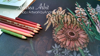
Flower #7 is the gerbera daisy. Though these are often seen as bright colors (think highly saturated oranges, yellows, or pinks), they are also occasionally available in more neutral tones. To create this daisy, I used peach, pink, orange, red, and two shades of brown. The green was used for the gerbera daisy's stem.


After the daisy, I moved on to the sprig of jasmine blooms. In nature, these jasmine would be almost pure white, with just a hint of yellow - but because I want these flowers to mimic skin tones found throughout the U.S., I made them a little darker, with a bit more tan coloring. I used white, pale peach, two shades of orange, a dark yellow, cream and pale yellow, and two shades of green for the stem.


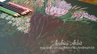
The chocolate ti leaf in the center of the bouquet was a bit of a challenge. I wanted to give it the same attention I gave the lighter colored flowers, but the more detail I added, the lighter it got - and I also didn't want to lighten it too much from the black paper background, since this chocolate ti leaf is the darkest plant in my bouquet. I settled for adding some dimensionality with dark browns, dark reds, and dark purples, and giving just the faintest bit of highlights in pink or gray along some of the edges of the ti leaf, to define it. The base of the ti leaf has a bit of green, to mimic the ti leaf's coloring in nature.


Next came the bunch of carnation blooms. I used two colors of green for the stems and leaves, then completed the flowers with orange, yellow-orange, and a light tan colored pencil.


I next moved on to the peony flower. I love the shape of this flower, and how soft its edges are. I used two shades of orange for the shadows, and a combination of pale pink, pale peach, and white for the highlights.


The two chrysanthemum flowers were drawn with a light tan pencil, yellow-orange, a bit of pink, and the "pumpkin orange" pencil that works as a great neutral (because on the black paper it almost looks like brown). As I often do, I let some of the black paper show through to get the darkest shadows/to define the edges of the petals for me.


Now the first dozen flowers are complete! This drawing is going along a lot faster than my previous two drawings - I think because it's really one larger drawing instead of a collection of smaller ones.
Once the last dozen flowers are finished up, I'll just have to put some finishing touches on the vase and add any final details or make any final adjustments to the coloring throughout the bouquet.
This is lovely!
ReplyDeleteThank you!! :)
Delete