These two watercolor paintings are from either Watercolor II or Watercolor III. The assignment was to use different materials - such as bubble wrap, wax paper, wrinkled plastic wrap, and tissue paper - to layer different textures and create an abstract painting.
Purchase "Purple Chaos" through my Etsy shop!
I would give the paper a wash of lightly colored water and then place one of the materials on the still-wet page, leaving it there while the watercolor dried, so that the pigment would dry in the crevices and create an interesting pattern. When I was finished, I played up certain shapes or colors by going over them with my brush, to make sure that the composition was interesting.
For "Purple Chaos," I chose a mostly cool color palette, focusing mostly on purples. Then, I added warm reds for emphasis. I also darkened the shapes near the bottom and kept the top of the paper light, to add contrast and focus to the work.
Finally, I added some white crayon in the negative space around some of the purple shapes to further increase the contrast, and add more texture.
The assignment was to make two of these paintings - one that had a cool color palette, and one that had a warm color palette. We were also encouraged to use more geometric shapes (sharp edges and angles) on one painting, and organic (curved, irregular) shapes on the other.
So the companion piece to "Purple Chaos" is "Orange Chaos," shown below:
Purchase "Orange Chaos" through my Etsy shop!
This one uses lots of oranges, yellows, pinks, and red-violets, with just a hint of green in the background to add a bit of color from the cool side of the color wheel.
The same method of layering different materials into the wet pigment was used, but this time with an emphasis on organic forms.
These paintings would look great hung together or separately. I don't have mats or frames for them, but their size is close enough to the standard 11"x14" that it shouldn't be difficult to find mats and frames. I think classic white mats would look best, and really draw out the lighter colors in the backgrounds of each piece.
Because these are paintings from early college, I've reduced the price 50% of what I typically charge for 11"x15" size watercolor paintings. Each painting is only $99.
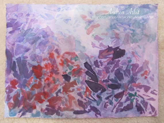 |
| "Purple Chaos" 11"x15" Watercolor on Paper Andrea Arbit |
Purchase "Purple Chaos" through my Etsy shop!
I would give the paper a wash of lightly colored water and then place one of the materials on the still-wet page, leaving it there while the watercolor dried, so that the pigment would dry in the crevices and create an interesting pattern. When I was finished, I played up certain shapes or colors by going over them with my brush, to make sure that the composition was interesting.
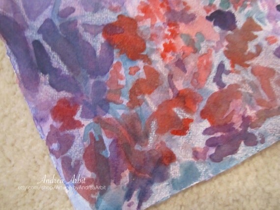 |
| "Purple Chaos" Watercolor Painting - Detail |
For "Purple Chaos," I chose a mostly cool color palette, focusing mostly on purples. Then, I added warm reds for emphasis. I also darkened the shapes near the bottom and kept the top of the paper light, to add contrast and focus to the work.
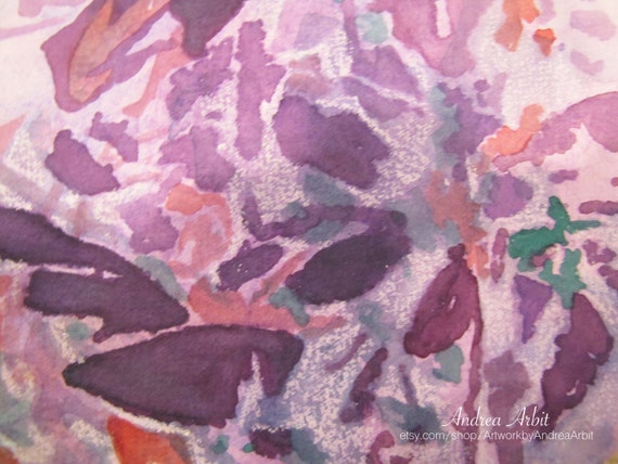 |
| "Purple Chaos" Watercolor Painting - Detail |
Finally, I added some white crayon in the negative space around some of the purple shapes to further increase the contrast, and add more texture.
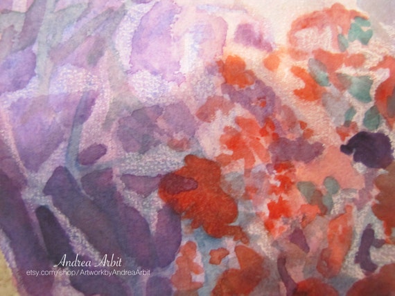 |
| "Purple Chaos" Watercolor Painting - Detail |
The assignment was to make two of these paintings - one that had a cool color palette, and one that had a warm color palette. We were also encouraged to use more geometric shapes (sharp edges and angles) on one painting, and organic (curved, irregular) shapes on the other.
So the companion piece to "Purple Chaos" is "Orange Chaos," shown below:
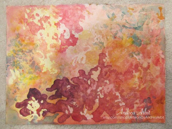 |
| "Orange Chaos" 11"x15" Watercolor Painting on Paper Andrea Arbit |
Purchase "Orange Chaos" through my Etsy shop!
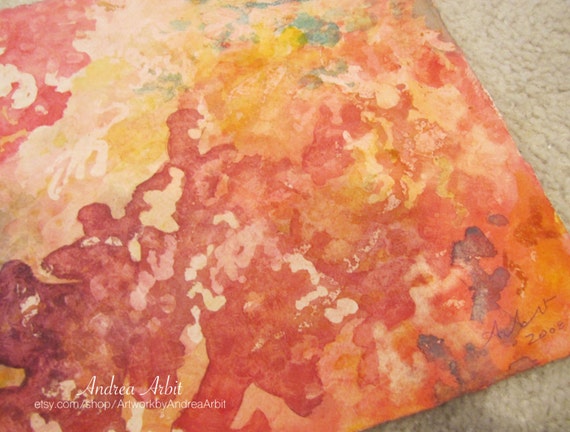
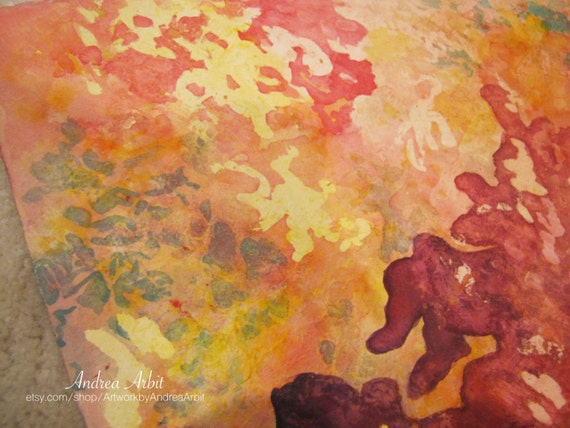
This one uses lots of oranges, yellows, pinks, and red-violets, with just a hint of green in the background to add a bit of color from the cool side of the color wheel.
 |
| "Orange Chaos" Watercolor Painting - Detail |
The same method of layering different materials into the wet pigment was used, but this time with an emphasis on organic forms.
 |
| "Orange Chaos" Watercolor Painting - Detail |
These paintings would look great hung together or separately. I don't have mats or frames for them, but their size is close enough to the standard 11"x14" that it shouldn't be difficult to find mats and frames. I think classic white mats would look best, and really draw out the lighter colors in the backgrounds of each piece.
Because these are paintings from early college, I've reduced the price 50% of what I typically charge for 11"x15" size watercolor paintings. Each painting is only $99.
No comments:
Post a Comment