Saturday, January 27, 2018

Train Map - Custom Graphic Design

My uncle has a model train setup in his basement, complete with railroad tracks, natural features (mountains, rivers, ponds, trees), and little buildings and people. This past Christmas, he asked me to design him a 18x24 map, which he could display on the wall near his train setup. He sent me a rough sketch of what he was thinking, along with a list of town names or important stops along the route, and some picture of his setup for inspiration.

Since he is into baseball (and the history of it), he gave the towns the names of historic baseball players, and named his fictional railroad company "Cobb Valley Railroad". His favorite colors are orange and dark blue (Detroit Tigers colors), and he wanted there to be more color than on a "typical" (boring) train map - such a green background, and colorful artistic-rendering "snapshots" of certain areas of his setup.

I designed it in Adobe Illustrator and printed it for him at FedEx Office for his Christmas present.

Here is the digital version of the design:


And some detail shots of the "snapshots", track layout, and CV logo I created:


He had a 18x24 black frame he wanted to use, and was so excited about his Christmas gift that he immediately went and got the frame to put his new map in. :)


I am available to create similar custom graphic design posters for other projects, as well! If you'd like to talk to me about your ideas or commission a poster, you can email me at afrownfe[at!]gmail.com.


Sunday, January 21, 2018

Bathroom Color Scheme & Artwork

A big project we undertook in 2017 was to have our guest bathroom renovated. This is the nicest, largest bathroom of our house, but one that doesn't often get used (yet). We also have a powder room on the main floor and a small bathroom off the master bedroom (which just has a standing shower - not a tub). We replaced the toilets and vanities in each of the three bathrooms, and completely overhauled the large guest bathroom with new tile, new cabinets and counters, new sinks and faucets, a new tub, new lighting, new toilet, new mirrors, and new paint color. With the exception of the paint color, which we did ourselves, we had a company in our town manage the project. It took twice as long as they originally estimated, putting us out for two months - but the end result is beautiful!

I wanted a gray/white/purple color scheme, with white tile, sinks, tub, and toilet, medium/dark gray cabinetry, and purple walls. I had them lay the square floor tiles diagonally, and the matching "subway" style shower tile in a herringbone pattern - because I love how dynamic those lines look when they aren't set up in the typical boring parallel/perpendicular way.

For the paint color, I didn't want to go too "girlie" with the purple color - but I still wanted something bright as a contrast to the neutral white/gray everywhere else in the bathroom. I tried to pick a purple that had some gray in it, and one that was also light enough that it didn't make this windowless bathroom too dark - since the gray cabinets already added to the darkness.

Finally, I finished up the bathroom with some matching purple rugs and towels, and by creating a custom piece of art for the wall.

And now (since you're dying to see them, I'm sure!), here are the photos!

Before the renovation:


At the start of the renovation, after they tore everything out:


The finished room - with awesome tiles and more cabinet space!


I decided that I needed some vertical artwork for the wall near the bathroom/tub, and when I couldn't find anything in the colors/style I wanted to, I made it myself.

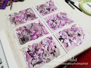
I picked out a white frame that would hold four small paintings. Then, using some small pieces of paper torn from a watercolor sketch book, I went about making the paintings. Even though my frame would only hold four, I made six small pieces - knowing that some would turn out better than others, and that I would want options to choose from.

I wanted to do an abstract style, and I wanted to incorporate the white of the tub, toilet, tile and counters, the light gray veins in the tile and counter, the color of the darker gray cabinetry, the color and shiny chrome texture of the silver faucets, towel racks, and lighting fixtures, and a nice purple to go with the purple color we painted the walls. I also really liked the abstract leaf-print shower curtain we found (which had simple leaf-shapes in shades of purples and grays), and wanted to incorporate some leaf-like shapes into the design as well.

I taped down my six small pieces of paper with masking tape, so they wouldn't curl up too much when I got them wet with paint.


For the first layer, I used black India ink, super pigmented purple ink, and iridescent acrylic medium - which you would usually mix with acrylic paint, but which I just used straight from the jar for a sparkly/metallic look.


Then, I just went to town. I layered wet washes of ink with thinner brush strokes. I used the iridescent medium to just smear some areas with shine, and I used the black and purple inks to write/draw curvy lines and the hints of some leaf shapes.

I threw some cotton makeup rounds on there just to soak up some extra moisture while they were drying.


For the next layer, I used white pastel chalk, metallic silver and pink markers, and a thinner metallic silver pen to "collage" more leaf-shapes onto the paintings, and add visual interest.


Once I was satisfied and everything was dry, I pulled the masking tape off and chose which four of the six I would put in my frame.


Here's the final piece hanging in the bathroom!


I had a lot of fun "experimenting" with the abstract style for the artwork, and playing around with some art materials I don't usually use. It's exactly what I wanted to finish off our new bathroom.

Do you have a space that needs some custom artwork? I'd love to help you out! Leave a comment below or send me an email at afrownfe@gmail.com to let me know what you're thinking of. :)


Monday, January 15, 2018

Dahlia Tattoo

Exactly one month ago, as a five-day-early birthday present to myself, I finally got a tattoo! It's something that's been on my bucket list for several years, but I kept putting it off because I wasn't entirely sure what I wanted to get a tattoo of. I considered Harry Potter quotes for awhile - but there's too many good ones and not enough short good ones, and I didn't want an entire paragraph written on my skin. Then, I stumbled on pictures of floral "watercolor style" tattoos on Instagram several months ago, and that opened up an entirely new world of possibilities. I was really drawn to the idea of getting something pretty and artistic on the inside of my left forearm, near the inside of my elbow - something that would act as an extension to my body of artwork (floral, colorful, and heavy on the symbolism), and something that I would love and appreciate - and be able to see - every day.

But knowing that I wanted a colorful flower wasn't enough for me (of course). I wanted my tattoo to mean something more specific than just "a pretty flower" or "beautiful colors" or "a reference to my floral artwork". I carefully considered (as I do with much of my art) what the message of my tattoo should be - that is, what type of flower I should choose.


Brand new tattoo!

I settled on a dahlia flower because dahlias stand for a lot of cool things, including wisdom, creativity and art, drawing upon inner strength to succeed, maintaining kindness, grace and dignity in the face of adversity, embarking on new adventures, making positive life changes, and forging my own unique self-identity. They also symbolize a lasting commitment - and I don't know what's a more lasting commitment than a permanent tattoo. :) My dahlia tattoo is a promise I'm making to myself 1) to be kinder to myself (that is, to stop all self-abuse and negative thought patterns and start treating myself with the same kindness and respect I show my friends), and 2) to be unashamed and unafraid to be who I am, feel the things I feel, or want the things I want.

I designed the tattoo myself. I drew/traced several images of dahlias until I got one that I thought would work. I also played around with the amount of petals, cutting some of them away to simplify the flower a bit, given the size it would be on my arm. Then, I blew it up to 8x10 size (to make it easier to paint), traced it onto watercolor paper, and added some light watercolor washes, just to decided what colors I wanted to use and where I wanted those colors on the tattoo design.


The watercolor sketch before I added black outlines back in.

I chose purple, blue, pink, and green for the colors. Purple is often associated with wisdom, elegance, intellect, depth, and beauty. Blue and green symbolize new life, fresh starts, and changes. The pink I added just because it's pretty - and I wanted a lighter color to make sure the darker purples and blues didn't make the tattoo too dark. These are also probably my four favorite colors (though I like so many colors, it does change a lot), and I have a lot of clothes in those colors, which will help my tattoo "go" with most of my wardrobe.

When the watercolor paint was dry, I went over the light pencil lines with a black Sharpie. Then, I used my copy machine to shrink it back down until it was the smaller size I wanted/the size that would fit on my arm.


Printing copies to try to figure out what size it should be on my arm. (The leaves point down to my wrist.)

The copier made the colors a lot duller, but I made sure to pick out with my tattoo artist the bright colors I actually wanted. I also told her I'd like to extend the extra pigment out further from the black outlines, to give it a more abstract/painterly quality. She used my to-scale copy to trace the design onto my skin, then inked the black outlines and the areas of color.

It hurt less than I thought it would, and went quicker than I thought it would too. It only took them about 1-1.5 hours to finish the tattoo. It also healed faster than I was told to expect, which was another nice bonus!

Here's what it looked like last week, three weeks after I got it:


It can be hard to get a good, clear picture of it... Not sure if that's the nature of this kind of tattoo, or just a problem specific to my phone camera (but I'm guessing probably the latter). :)

Now if only the weather would stop being so cold, maybe I'd actually be able to wear more short sleeves to show it off!

Friday, January 12, 2018

Upcoming Event: Heaven Spot Salon Night at Young Felix Loft

Exciting news!

My colored pencil drawings from the recent GRRRLS Like Us exhibition are going to be featured in Heaven Spot's latest episode of Detroit area artists, which will be shown at their Salon Night event one week from today, on Friday, January 19th, from 8 - 10 pm.

In addition to a viewing of the episode, there will be acts from movement group People Dancing, musician Greg Panzica, and a scene from Young Fenix's production of "For Colored Girls" by Ntozake Shange. Fellow colored pencil artist Mariel Collins and I will be there to answer questions about our artwork.

Heaven Spot is a group dedicated to promoting local artists and Young Fenix is a nonprofit organization committed to building community through art and activism - an artist creative collective located in the Detroit Eastern Market district.

The event will take place at the Young Fenix Loft at 1440 Gratiot. Entrance and parking are accessible in the rear of the building on Service St., off of Russell. Doors open at 8 pm. Admission is $10 and can be paid in cash at the door.

For more info or to RSVP on Facebook, visit: facebook.com/events/159425498022053/

Tuesday, January 9, 2018

Christmas Card Design

Every year my mom commissions me to create a design for their Christmas cards. Last year, it was "Little Drummer Boy" themed, in memory of my grandfather who passed away in 1996. This past Christmas season, my mom wanted an angel theme, in memory of my grandma who passed away in July 2017. Because my grandma lived with my parents, the last few years the Christmas cards have been signed by my parents, my brother, and my grandma - this would be the first Christmas since my grandma moved in with them in 2014 that the cards were coming from only my parents and brother again.

My mom wanted the front of the cards to say "Gloria in Excelsis Deo," with a verse from that Christmas hymn on the inside of the card.

I already had various inks and markers out from a previous art project (which I'll make a blog post about next!), so because I had those materials already on hand, I appropriated them for this Christmas card as well. I used black India ink, and high pigment blue and purple inks to start the design:


I then added some metallic gold ink. Once that was dry, I added more details with black Sharpie.


Then, I scanned in this mini-painting I'd created, resized it to fit on a card, and faded it into a lighter background. I reincorporated some of the abstract background swirls in the upper right corner of the design, as well.

I used Adobe Illustrator to add in the text and set it up to print as notecards.


Here is the inside of the card, and the back of the card:


I printed all of the cards for them as I print my typical art notecards. Then, I printed address labels, stuffed envelopes, labeled them, stamped them, and mailed them out in early/mid-December.


I can create custom holiday cards for your family, too! Email me at afrownfe@gmail.com for pricing and other information.

Wednesday, January 3, 2018

A Busy December / New Projects

I was very busy in the month of December, working on designing my parents' annual Christmas Card, writing a "Year in Review" newsletter with my husband to send out to our family and friends, meeting Etsy orders for printed-on-demand notecard sets and custom watercolor bouquet paintings, making DIY holiday gifts (like baked goods and a graphic designed map for my uncle's model train set-up), getting a tattoo (more on that soon!), and working extra hours for Temple Israel, helping them migrate content over to their new website.

Of course, I didn't have time to write about all these projects while I was working on them (who would?) - so in the coming weeks you'll see some special posts recapping what I worked on in December, as well as some posts going in farther back, to little projects here and there I did for friends, family, and to decorate my own home in 2017.

I will also be spending January starting on the acrylic triptych I teased in my Art Year in Review post. My sister-in-law commissioned me to create a large-scale painting for her apartment in Charlotte, NC of the Charlotte skyline, which kind of got back-burned as I finished up getting everything ready for my "GRRRLS Like Us" exhibition in November, and then dealt with December's holiday rush. I'm excited to do some acrylic for a change (especially after a year of mostly colored pencil with a bit of watercolor thrown in)! Since I'll be busy planning, sketching, and starting to paint, I probably won't get around to posting any "in progress" photos here until at least February (depending on how fast the painting goes).

As usual, I have plenty of ideas for future artwork - but not nearly enough time to devote to them all. (A good problem to have, I think.) January and February blog posts will probably look like an eclectic hodgepodge of projects; in fact, this entire year might seem more scattered than the last, given that I don't have several huge projects planned for 2018 (yet) like I did in 2017, culminating in an exhibition of the fruits of my labor. Now that I have several large colored pencil drawings framed and ready to go, I will probably be looking for more exhibition opportunities to display them - but I don't have anything lined up yet.

I'm just jumping into 2018 this year... We'll see where that takes me! If there are fewer/more scattered blog posts for the next few months, know that it's because I'm happily busy doing things I love, experimenting with art, and exploring new avenues - and that anything really cool I create or accomplish will get mentioned on here eventually. :)