Showing posts with label in progress. Show all posts

Thursday, April 29, 2021

Painting the New House: Basement Bathroom

The last room we painted right after moving in was the new bathroom in the basement. The previous owners had finished most of the basement - except the bathroom. So when we had our contractor working on adding a few walls to create a studio for me, a guest room, and a pantry space, we also had him finish the bathroom. He added flooring, put in a toilet, corner shower, and vanity/counter, and added a light fixture. After we moved in, we then painted the bathroom the same purple we used in our upstairs hall bathroom in our old house ("Magic Scent"). Once the paint was dry, we picked out and installed a towel bar, a towel ring, a mirror, and a shelf for extra towels.

Here's what it looked like after the contractor was finished:


And here is the bathroom with the finished walls:


Finally, here it is with the finishing touches installed, and towels hung:


I painted the abstract purple-and-gray set of artwork in the white frame hanging above the toilet, to go in our new purple bathroom in our old house once that bathroom was remodeled. It's one of the reasons we chose the same purple for the bathroom here - so we could reuse that artwork, and because we already had the purple bathroom rugs and towels to match. Plus - I just really like the color. :)

Wednesday, April 21, 2021

Painting the New House: En Suite Bathroom

When we moved into our house in January, we did a lot of painting. I've already posted about our daughter's nursery (which I actually did in November/December), the accent wall in the dining room (which I completed in early January, the weekend before we moved in), and the green guest room walls (which I painted in January, between when we moved in and when our furniture arrived). There are two more rooms we also painted - and both were bathrooms. There was no real rush to paint these, since there wasn't any furniture to get in the way (a bathroom is awkward to paint no matter when you paint it - all the "furniture" are built-in things you can't easily remove!)... but I still wanted to paint them sooner rather than later, while I was still excited to have this new house, and motivated to turn our house into our home. When it comes to house renovations or projects, if you're inspired or excited or motivated - definitely do the project ASAP, before that inspiration, excitement, and motivation dissolve into the ennui of daily life. ;) With that in mind, I painted the en suite bathroom in late January, and the basement bathroom in early February, within that first month of moving in.

Our old house had a dark blue bathroom on the main floor. The vanity cabinet and countertop were white, and on the wall we had 1) a white collage frame of 4 postcards from Santorini, one of the Greek islands where my husband and I went on our honeymoon in 2011, 2) a mosaic tile in the shape of a seashell in whites, blues, and oranges to match the postcards, which I had commissioned from an artist I found on Etsy, and 3) an off-white decorative square tile, which we hung at a diagonal. I liked these pieces together, and the idea of a blue-with-white-and-orange-accents bathroom in general, and I wanted to recreate that somewhere in our new house. The bathroom that made the most sense was the en suite bathroom, which had white tile floor, a big white Jacuzzi tub surrounded by more white tile, and an arched window.

Because the en suite was a much bigger room than the small half-bath that had been our blue bathroom in our old house, I had to rethink the shade of blue a bit. I didn't want to go too dark, because with the room so big, I worried that would make it really dark. So I chose a medium blue called "North Pole Blue," a funny name for a wall to go with our Greek-Island blue-and-orange themed bathroom.

As with the other rooms we painted, we taped off all the edges - the trim, the tile, the mirror, etc. Ceramic tile is nice in that paint scratches off it pretty easily, so you don't have to be as diligent about not dripping paint on the floor as you do when you're painting over carpet; but I still wanted to minimize the amount of picking paint off the tile I'd have to do later on, so we put up a lot of tape regardless.

This is the room my partner helped me with the most. I painted our daughter's stripes, the dining room accent wall, and the green guest room entirely by myself, but for this bathroom, he was able to help me with the painting, and we split it about 50-50... and I gotta say, it felt like it went SO much faster to have someone there helping me. I'm sure part of that is because it actually was a lot faster - but just having someone else in the room to talk to while we painted also made the time fly. We put the tape up and painted the same night, we did touch-ups the next morning, and it was done in less than 24 hours.

Here are some "before" shots, when the bathroom was still a very pale green/gray:


Here are some in-progress photos of our prep and painting:


And here are some photos of the finished bathroom:


There is still a lot of wall space not being used, and I'm trying to think of what to add to them that will fit the Greek Island theme. There are also seashells on the tile around the tub now, but I haven't gotten the chance to take a good picture of them yet. I love the blue and orange combo!

Tuesday, April 13, 2021

"Faith" Colored Pencil Drawing

The first colored pencil drawing I completed after our move to Ann Arbor was this one, of iris flowers on blue paper, which I drew in February 2021. Springtime iris flowers represent "faith" - something I personally connect a lot with hope, pride, and self-reliance. I have faith in myself, in my support system, and (usually) in humanity as a whole (though admittedly that faith has been tested quite a bit these last few years). 

As usual, I used Prismacolor brand pencils and Canson Mi-Teintes blue paper for this 8"x10" drawing, and I started with a light sketch to lay out where I wanted the iris flowers to lay compositionally on the page.


Once that initial sketch was complete, I went through and added details like veining on the petals, as well as highlights and shadows to give dimension. I ultimately used 10 colors: white, yellow, light green, dark green, dark blue, two dark purples (a blueish purple and a reddish purple), light purple, light blue, and a dark pink.


Behold the finished drawing:


What do you guys think of my new studio setup? I worked on this drawing after my daughter went to bed (so no natural light coming in through the windows). I have my colored pencil desk set up under one of the recessed lights in the ceiling, and I also had a spotlight desk lamp situated directly over the page. I think you can definitely see a difference in the photos at the very least - they're better lit than photos of my colored pencil works-in-progress used to be!

Monday, April 5, 2021

"Creativity" Colored Pencil Drawing

The last colored pencil drawing I made before packing up all my art supplies to move was this 8"x10" drawing of dahlia flowers on blue paper, completed back in August 2020. Dahlias symbolize many things (including some personal symbolism for me, given the dahlia tattooed on my arm), but one of the big ones is creativity, which is why I gave the drawing the title "Creativity."

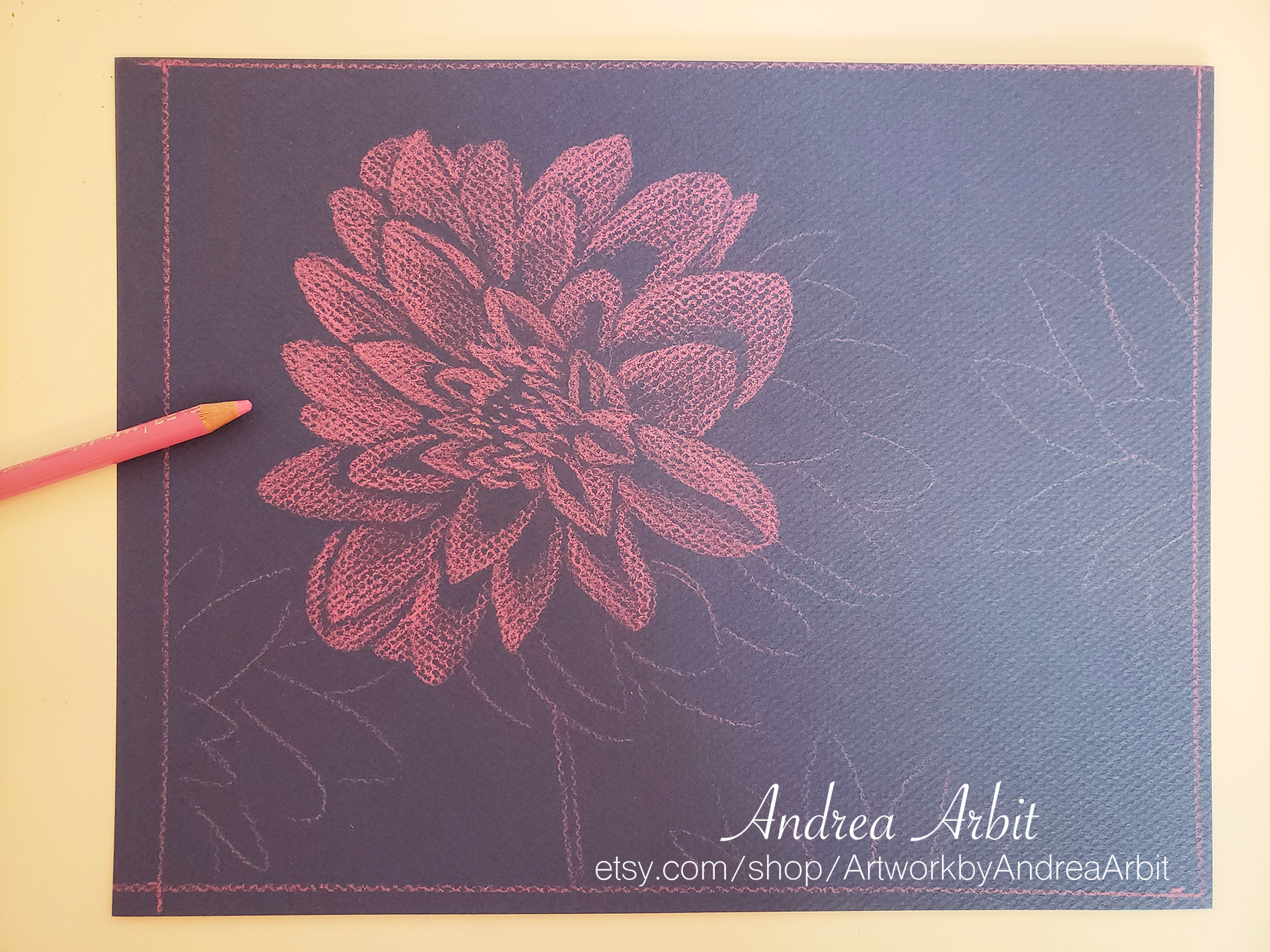
I used Prismacolor pencils and blue Canson Mi-Tientes paper. I started with a quick line sketch of how I wanted to lay the dahlia flowers out on the page, and then filled in the shapes to make quick monotone value studies with the same pink pencil - coloring more pink in areas that were lighter, and leaving more of the darker blue paper showing in areas of the petals that were in shadow.


Once this preliminary sketch was in place, I grabbed more pencils and started going through petal by petal to give the flowers more depth and dimension. I used white for highlights, purple and black for shadows, and three shades of pink/red in between.


Here is the final drawing:


I love the way the pink pops against the blue paper (and the blue paper gives the dahlia a nice blue undertone, so that its coloring is a realistic purplish pink dahlia color)!

Monday, March 8, 2021

Painting the New House: Dining Room

I already shared photos of the yellow and orange stripes I painted for my daughter's nursery in our new house. That was by far the most time consuming paint project I took on so far. But that's not to say it was the only one! We also painted an accent wall in the dining room, and we painted the new guest room and bathroom in the basement, as well as repainted the en suite bathroom upstairs. I say "we" because my partner and I are a team - I picked out all the paint colors, he went to Home Depot (in a pandemic!) to pick them up, and (depending on the room in question) we both did some of the prep work and painting. I couldn't have done it without his help and support... But now that I've gotten that out of the way, I'll just be using "I" pronouns from here on out, because yes, I did most of the actual painting - especially in the dining room, which is what today's blog post is about.

When we bought it, the house had the same beige color on the walls of the living room, entryway, dining room, and the upstairs hallway - except for one wall in the dining room, which was also beige, but with thick dark blue stripes. I've nothing against stripes (hello, did you see what I did in my daughter's bedroom?), but these stripes were just Too Much. First, they weren't painted all that well, and when you got up close you could see where the paint seeped through the painter's tape and made a line that was not very precise. But second, it didn't fit our aesthetic. Our dining room furniture is a combination of hand-me-downs from my grandmother and my husband's great aunt. It's not modern or "cool" like the dark blue stripes were trying to be. I have my grandmother's teacup collection hanging on the wall, and we have a cabinet full of tchotchkies ranging from more teacups, to glass souvenirs, to Judaica (Jewish items like Shabbat candle holders and Kiddish cups). On top of all that, the dining room and living room have an open floor plan, and our living room furniture is also a grandmotherly aesthetic (and also inherited from my grandma) - floral couches that I absolutely adore. The dark blue just wasn't working for me.


Repainting that wall wasn't an urgent update the house needed immediately... but it was a project I wanted to do before moving in regardless, just because I knew it'd be easier to do before we had too much furniture and stuff in the room. Thankfully, it was also a quick project, since it was just one wall. In our old house, we painted the kitchen this pretty dusty brownish-pink color called "Cinnamon Cocoa," and I thought something similar to that would work well for our new dining room accent wall, but I also didn't want it to be too close in value (light to dark scale) to the beige color that the rest of the dining room (and much of the rest of the main floor) was. So I had my husband grab me some paint swatches in that general pink color family, and ultimately settled on "Red Clover," a bit darker than "Cinnamon Cocoa" was. It looks great against the beige, goes well with the wooden dining room furniture, and ties in nicely with the floral couches in the living room (which have some pinks in them). 

I made a special trip down to the new house one night and taped the two walls the accent wall touches, as well as the ceiling, floor trim, and window trim, a couple days before I planned to paint. 


Then when we went down that weekend (the last weekend before the weekend that we officially moved in!), I spent about 2 hours painting the wall while my husband and daughter played nearby. It took 2 coats of paint to cover some of the dark blue. Because it was so close to moving day, we'd brought many of our boxes and smaller pieces of furniture already, so there was a lot of stuff in the dining room - and a lot of it wasn't the right stuff (a.k.a. the stuff that would eventually live in the room). But the big furniture wasn't there at least... and all the boxes actually came in handy, since they allowed me to cordon off the wall I needed to paint, to keep our 1-year-old away while I painted. I created a "wall" of boxes and used a small bookcase on wheels as a "door" to allow me to get in and out. 


And here's the wall once it was all finished, dry, and the white curtains were rehung on the window... and all the extra boxes and stuff moved to its proper location.


It looks even better with the furniture and decor in the room!


I love the way it turned out - just like repainting stripes in my daughter's room, this felt like taking a bit of our old house to the new house with us, since we used one of our favorite colors we painted in the old house as a basis for what this accent wall would be. I think it works great with our furniture!