Showing posts with label composition. Show all posts

Saturday, January 18, 2020

Planning for Nursery Artwork

In August and September last year, I created 5 watercolor paintings for our nursery: three smaller paintings, 8"x10" in size, each featuring a cartoonish woodland creature (a fox and two owls), and two larger watercolors, 22"x30" in size, each featuring one of my pattern designs and a quotation.

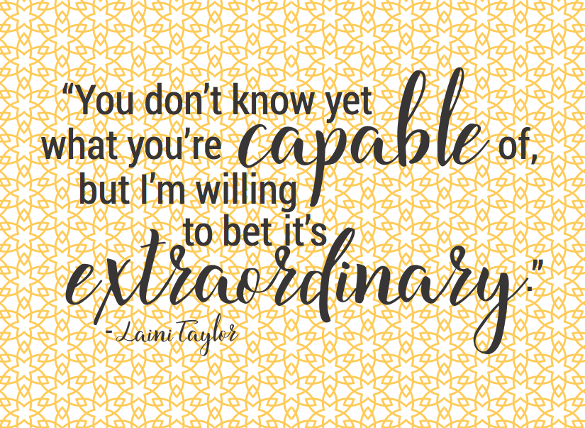
I picked out one quotation; my husband picked the other. The first was from Harry Potter and the Goblet of Fire, by J.K. Rowling - "It matters not what someone is born, but what they grow to be." The second was from Muse of Nightmares by Laini Taylor - "You don't know yet what you're capable of, but I'm willing to be it's extraordinary." These were quotes that we found inspiring, and with messages that we wanted to instill in our baby, both from female authors who'd written works we loved.

I spent some time working out the composition on my computer first, spacing out the quotations in Adobe Illustrator and coupling each with a pattern. I knew I wanted to use a script-y font for some of the words but not the whole quotation, so I picked what I considered to be the two most important words in each quote, and decided to make those large and in the script font I liked, while keeping the rest of the quotation simpler.

I also considered using multiple patterns in the background (since I have so many patterns I've designed, might as well use them, right?) but it ultimately kept looking too busy, no matter which combination of patterns I tried. So I decided to use just one single pattern for each painting.

Here are the two digital compositions I created:


Once I had the design, I printed them 8.5"x11" size to show my husband and get his approval before tiling them out and printing them to size. Each painting used 12 sheets of 8.5"x11" paper, with 1/12th of the design printed on each piece. I then taped these pieces together to make the 22"x30" design, so I could trace the pattern and quote onto my 22"x30" full size watercolor paper.

Here is a close-up of the two patterns traced onto two sheets of watercolor paper:


Here is the entire first quotation, traced and ready for me to start painting:


And here is the entire second quotation, traced and ready to go:


I did something similar for the three smaller woodland creatures - I found images of cartoon owls and foxes that I liked online, printed them out, and traced them onto 9"x12" watercolor paper (so that there would be room around the edges for me to tape down the paper while I was painting).

With my planning complete, I was ready to begin the real fun! My next several posts will show the step by step process of how I painted and finished off these watercolors, hanging them in the nursery before our baby's arrival.

Monday, June 17, 2019

Planning for Rainbow Alphabet Watercolors

I enjoyed making my floral alphabet watercolor series so much that I decided to make another set of 5"x7" alphabet watercolors - this time with a painted background (instead of painted letters), leaving the letters as blank negative space like I often do for my custom name paintings (like this recent one for Henry).

I wanted to do a rainbow background, starting with red on the top, bleeding into yellow (it's hard to get a good orange color straight from a tube, so I planned to let the red and yellow mix on the page to achieve a blended orange in between them), then light green, dark green, blue, and violet on the bottom.

To prepare for these 26 small paintings, I first grabbed 13 pieces of 9"x12" watercolor paper, and measured each into two 5"x7" rectangles, with a small margin around them (to help tape the paper down on the table while I painted). I cut out these rectangles and saved the little bit of extra paper for future use (scraps can come in handy when you're trying out a new watercolor tube and want to see what color it looks like).


Next, I selected what font I wanted to use for my letters. I wanted something with a serif, so that simple letters like the capital "I" wouldn't just be a line, but have at least a bit of visual interest. On the other hand, I also didn't want anything too thin, with really delicate serifs, because I knew I'd be painting these fast. I would put a lot of water down around the letters to get the wet-on-wet effect I was hoping for, and then use six highly saturated pigments (red, yellow, light green, dark green, blue, and violet) directly on that water before the water started to dry too much.

I ultimately chose to use Charter Bold for my font. Looking at the widest letter (usually a capital "M" or "W"), I decided what size to print the letters at so that there would still be enough space around the wide letters for it to comfortably fit on a 5"x7" size piece of paper - which in this case was size 280. Then I printed out all 26 capital letters, each centered in a 5"x7" square.


I traced these letters onto my watercolor paper by holding both pieces of paper up to the window on a sunny day, and lightly using pencil on my watercolor paper to outline the letters. Then, I taped down the first several paintings-to-be to get started on the fun part! Below you can see the first two letters, lightly traced and taped down, ready to be painted.


My next blog post will show the in-progress painting for the first 8 letters - A through H! Check back soon.

Sunday, February 11, 2018

Charlotte Skyline In Progress (Planning & Sketching)

My sister-in-law, who lives in downtown Charlotte, North Carolina, recently commissioned me to create a massive acrylic painting of the Charlotte skyline for her apartment. When finished, the entire skyline will take up three side-by-side canvases, each 22"x28" in size. She wanted a minimalist color scheme (blacks/whites/grays with earth tones and some gold/yellow) and wanted it to be more or less true to the actual Charlotte skyline.

The first step I had to tackle was lots of planning. I found a picture of the skyline online, traced the main, important lines I wanted to make sure to get proportionally accurate (i.e. the shapes of the buildings), and took lots of measurements of these shapes. Then, I figured out what my scale factor would be to scale my 8.5"x11" print-outs up to the right 22"x28" canvas size, and did a lot of math with my collected measurements to get a new set of data points. Next, I plotted these points and lines onto the canvases using a yardstick to help me measure, so that I would have a complete sketch of the skyline across all three canvases.

Today's blog post will show the step-by-step photos of how I sketched out the skyline, once I had all my initial measurements finished and my scale factor math complete.

Here are the three canvases, still in the plastic wrappers from Dick Blick art supplies. You can see the printouts I made for each canvas, which has 1/3 of the skyline. The color picture, a black and white version with the sky deleted (to help me see the edges of the building better), and the pencil tracing I made of those buildings, which I scribbled measurements all over. There is also a stapled packet for each canvas that lists all the scale factor measurements of what points I need to plot on the paintings.


I started with the far left canvas.


Then I moved on to the middle canvas, making sure to line up the buildings and other markings that bridged the gap between the first two canvases.


Finally, I sketched the buildings onto the right canvas.


Only once all of that planning and sketching were complete could I start putting paint to canvas. Check back soon for another blog post featuring step-by-step pictures of starting the acrylic paint.

Wednesday, September 13, 2017

"Ability Bouquet (Stronger Together)" - In Progress 1

My final 19x25 drawing in the "Stronger Together" series is called "Ability Bouquet." In it, I use 24 flowers that represent physical, emotional, and mental strength, health, and age-related abilities, as well as flowers in various stages of maturity (buds, full blooms, and dried/wilting flowers) or visible healthfulness (flowers that are limp, ripped, or otherwise broken).

For a longer blog post about what all I'm including under this "ability umbrella," please visit my last post.

The flowers that I chose for this bouquet are the following:
  • Daffodil - rebirth, new beginnings, uncertainty, returned affection, springtime, creativity, inspiration, renewal and vitality, awareness, inner reflection, memory, and forgiveness
  • Tulip - springtime, enduring love, forgotten or neglected love, abundance, prosperity, royalty, indulgence, charity and supporting the less fortunate
  • White Lilac - joy of youth, youthful confidence, purity, innocence
  • Crocus - youthful gladness, cheerfulness, glee
  • Cherry Blossoms - transience, good education, womanhood, love, wisdom, short lived beauty of youth
  • Dahlia - diversity, elegance, inner strength, creativity, change, dignity
  • White Rose - purity, innocence, reverence, silence, memory, loss
  • Hollyhock - ambition, abundance, fertility
  • Aloe - healing, protection, affection, grief, luck
  • Dandelion - overcoming hardship, resilience, healing from emotional/physical pain, emotional/spiritual intelligence, survival, long-lasting happiness and youthful joy, getting wishes fulfilled
  • Chamomile - patience, wealth, healthfulness
  • Geranium - fertility, health, love, protection, true friendship, comfort, stupidity, folly
  • Hellebore - scandal, calumny, poison
  • Acanthus - art, enduring life, pain/sin/punishment, mourning death
  • Lady's Mantle - comforting
  • Anemone - luck and protection against evil, abandonment, truth, sincerity, forsaken, sickness, vanishing hopes, death, parting, transition
  • Hen and Chicks Succulent - survival, always living
  • Lupine - happiness, inner strength to recover from trauma, new opportunities, positivity
  • Yarrow - good health, everlasting love, courage, psychic powers, cure for a broken heart
  • Heliotrope - eternal love, prophetic dreams, healing, warmth, invisibility
  • Marigold - pain, grief, cruelty, jealousy, beauty and warmth of the rising sun, creativity, drive to succeed
  • Tansy - hostile thoughts, health, longevity
  • Flannel Flower - mental health awareness, purity, safe boundaries, self-expression
  • Mullein - courage, protection, health, love, divination, exorcism

Once I decided which flowers to use, it was time to plan the composition for the drawing. I made some quick sketches on newsprint to figure out the placement of the flowers, and which ones I might show as damaged, browned, or wilting.


My next post will start the sketch on black paper!

Friday, July 14, 2017

"Religion Bouquet (Stronger Together)" - In Progress 1

As I've mentioned before, I have plans for six 19"x25" colored pencil drawings in this "Stronger Together" series. The first three are already complete (Race, Gender, & Sexuality), which leaves only three more to do (Religion, Class, & Ability). If you've read my last couple blog posts, which talk about religious discrimination and the separation of church and state in the U.S.A., I bet you can guess which drawing is coming next.

The first three drawings used a lot of color symbolism to convey my meaning - a wide variety of flesh-toned flowers for "Race," a pink-purple-blue spectrum for "Gender," and a rainbow/color wheel for "Sexuality" - because there are colors already commonly associated with each of these categories. For these final three drawings, however, that is not the case; instead of focusing on color then, these next three drawings will look more at the symbolic meaning of the plants themselves, or (in the case of "Ability" especially) other aspects of appearance besides color.

For my next drawing - "Religion Bouquet (Stronger Together)" - I looked especially at how different religions throughout the world have used flower symbolism throughout history and in the present day. Because many religions tend to use the same popular flowers - especially the rose, which is a common symbol in several different religions - the flowers in my drawing don't represent one-to-one symbols with specific religions. There was just too much overlap to conceive the drawing this way. Furthermore, I didn't want people who don't subscribe to any religion to be left out of my "Religion Bouquet" - so there are also a few flowers that have not been adopted by religions, flowers that symbolize a more general spirituality, morality, or humanism, and flowers which are associated with logic, reasoning, critical thinking, education, and science (all other things that humans can choose to prioritize, put faith in, and devote their lives to in the place of, or in addition to religious pursuits).

Here are the flowers I picked for this drawing (in no particular order), along with the symbolism of the flower, and any pertinent religious history:
  • tulip - faithfulness, devotion, passionate love, abundance, prosperity, royalty, and indulgence. In Victorian England, it also stood for charity and supporting the less fortunate, while in Turkey (and Islam more generally), it refers to paradise on earth or a reminder of heaven and eternal life.
  • purple lotus - divine beauty, purity, faithfulness, rebirth, resurrection, death, the womb of the world, fertility, eternity, and prosperity. In Buddhism, it symbolizes spiritual awakening. In Hinduism, it is associated with the gods Vishu and Brahma (among others). Because the lotus sits on mud without sinking it, it also stands for living without attachment to one's surroundings.
  • pomegranate - fertility (for its many seeds), abundance, marriage, royalty, and mature elegance. The fruit of the pomegranate plant has especially been used by many religions throughout history: Judaism sees the fruits as symbolic of the fertility of the promised land, and uses pomegranates to welcome in the new year (Rosh Hashanah). In Christianity, pomegranates that are split open refer to Jesus's suffering and resurrection; in Catholicism specifically, pomegranates represent the resurrection of the Church; and in Eastern Orthodox Christianity, they symbolize the sweetness of the heavenly kingdom. In Hinduism and Buddhism, pomegranates also represent prosperity, abundant fertility, and fruitfulness. In Ancient Egypt, they stood for prosperity and ambition. And in Ancient Greece mythology, they feature heavily in the story of Persephone, who was taken to the underworld by Hades and ate six seeds there - which is why we have six months of winter every year.
  • amaranthus (aka "love lies bleeding") - hopelessness, hopeless love, compassion, and sacrifice. In Christianity, it symbolizes the self-sacrifice of Jesus.
  • white jasmine - sweet love, beauty, sensuality, purity, good luck, love and respect, calm, and relaxation. It is also a Hindu bridal flower symbolizing attachment, modesty, deep and everlasting love, grace, and elegance.
  • white lily - virginity, purity, divinity, love, and self-sacrifice. In Christianity, these are known as Easter lilies, and also symbolize the Virgin Mary specifically.
  • orchid - industry, enthusiasm, boldness, pride, luxury, wealth, perfection, abundance, and prosperity. In many Asian cultures, it also stands for scholarly pursuit, integrity, and friendship.
  • enchanter nightshade - witchcraft, sorcery, and skepticism. It was used as an ancient herbal medicine and its Latin name refers to the Greek goddess Circe. In Wicca, it symbolizes drawing energy into one's life, balancing light/dark or male/female, and finding connectedness to all things.
  • holly - hope, protection from evil spirits, defense, and domestic happiness. It is tied to Christianity, due to the cross-shape of its flowers, and its red berries are associated with the Christmas holiday.
  • zinnia - wisdom, life, intelligence, sacredness, beating hearts, vitality, endurance through trials, and familial ties. It was named after a German botanist.
  • violet - love, affection, modesty, faith, nobility, intuition, dignity, devotion, and healing. In Roman mythology, the goddess Venus was said to have given it its blue color.
  • plumeria - beauty, charm, grace, positivity, and perfection. Buddhism, Hinduism, and Mayan cultures all use plumeria as a symbol for immortality, creation and recreation, life and rebirth, and generalized divinity. Hindus also associate the plant with dedication and devotion, while the Mayans believed that the plumeria flower gave birth to the gods.
  • gladiolus - strength of character, remembrance, honor, faithfulness, conviction, passion, infatuation, gladitorial combat/swordsmanship, cheerfulness, and compassion.
  • acanthus - art, endurance, immortality, regeneration, and mourning death. In Christianity, it is a symbol for pain, sin, and/or punishment (due to its thorns). In Ancient Greek mythology, it represented the healing abilities of Apollo, and it is said to be the inspiration for the Corinthian style column design.
  • morning glory - affection, gentle strength, tenacity, and unrequited love. Mexican cultures associate the flower with dreams and communication with the gods. In Christianity, morning glories symbolize mortality of life, or finality of life on Earth. And there is a Chinese legend associated with this flower of two lovers who neglected their spiritual duties to be with each other, which led the gods to decree that they could only meet one day every year; the flower therefore symbolizes the sweetness of earthly relationships. 
  • ti leaf - strength, high rank, divine power, protection against evil spirits, healing, and fertility. In Hawaii, this plant is sacred to the gods Lono and Laka, and the hula dance.
  • lychnis - religious enthusiasm, sunshine, eyes, and open air. It is also a medieval Christian symbol for the Virgin Mary.
  • sage - wisdom, immortality, long life, experience, connectedness to the world around us, and protection. In certain Native American tribes, it was considered a purifying herb and believed to ward off evil spirits and bad luck.
  • black eyed susans - justice and encouragement. Its botanical name (Rudbeckia) was given in honor of a Swedish scientist known for his accomplishments in medicine (anatomy), linguistics, music, and botany.
  • iris - wisdom, compliments, eloquence, good news, royalty, faith, and hope. It is also seen as a bridge between heaven and earth, and in Greek mythology was associated with the goddess Iris, who personified rainbows.
  • birds of paradise - freedom and the ability to travel, flight, optimism about the future, magnificence, excellence, success, royalty, paradise on earth, and romantic faithfulness
  • cattails - victory in mind, body and spirit, peace, prosperity, lust, balance, and stability. In Pueblo tribes, it symbolizes earth energy, water, and rain; the Navajo use cattails as a protective charm against lightning.
  • red rose - love, romance, sacrifice, and passion. In Hinduism and Buddhism, roses symbolize spiritual joy and wisdom. In Judaism, red roses stand for blood, life, and judgment. In Christianity, the red color represents Jesus's crucifixion wounds and sacrificial blood, while roses in general evoke the paradise of the Garden of Eden. The scent of roses and roses without thorns are said to symbolize the Virgin Mary - which one can see especially in the Catholic rosary. In Islam, roses symbolize beauty, divine love, and the human soul. In Christianity and Islam both, roses are associated with the scent of angelic messengers. Red roses are also symbolic of the English monarchy.
  • daffodils (aka narcissus and/or jonquil) - rebirth, spring, new beginnings, uncertainty, returned affection, luck, reward, creativity, inspiration, renewal and vitality, awareness, inner reflection, and memory. In Greek mythology, narcissus flowers represented self-involvement. In some Asian cultures, daffodils symbolize hidden talents and career-driven hard work. In Christianity, they are symbols of forgiveness and eternal life.
    In cases where the flower had natural varieties in more than one color, and the color of the flower did not alter its symbolism, I chose red, purple, yellow, or white - because I noticed that many of these flowers already fell into those four colors, and I wanted to play up that limited color scheme.

    Once I had all my flowers selected, I made a quick sketch on newsprint to decide the composition of the bouquet. I wanted to sprinkle those four different colors throughout the arrangement, mixing them up so that only rarely would two flowers of the same color be next to each other.


    Check back soon for "in progress" photos of starting the drawing on black paper!

    Monday, June 12, 2017

    "Sexuality Bouquet (Stronger Together)" - In Progress 1

    I've now finished two 19x25 colored pencil drawings in this series - "Gender Bouquet (Stronger Together)" and "Race Bouquet (Stronger Together)." My next drawing (if you couldn't guess from the title of this post, and the subject of the post from last Thursday) is going to be a similar drawing, with a similar idea - only this time concerning sexuality.

    Even though I define sexuality as more than just one's sexual orientation - also including one's sex drive and sexual behaviors in this category - I still thought the best way to visually symbolize sexuality was to go with an LGBT-inspired rainbow color scheme. The different saturation of each hue (i.e. dark blue, medium blue, and light blue) will then represent different "levels" of sexuality - the amount of sexual experience someone has, or the sexual desire they have.

    I knew I wanted to do two dozen flowers (which is how I many I did in each of my last two drawings as well), so I divided the number 24 by 6 for the six different main colors on the color wheel - three primary colors (red, blue, and yellow) and three secondary colors (green, purple, and orange). This meant that I would need to choose 4 flowers in each of the 6 color sections to get a total of 24 flowers.

    Here are the flowers I picked for this drawing, along with the color I'll use to draw it and the symbolism of the flower:

    • tulip (red) - declaration of love, true love
    • protea (red) - change, resourcefulness, daring, transformation, diversity, courage, keeping thoughts and knowledge to yourself
    • amaryllis (red) - pride, worth beyond beauty, splendor, sparkle, strength, self-confidence
    • poppy (red) - slumber, peace, death, extravagance
    • gerbera daisy (orange) - cheerfulness, joy, high esteem, admiration
    • lily (orange) - refined beauty, remembrance, passion
    • rose (orange) - desire, passion, enthusiasm
    • zinnia (orange) - thoughts of absent friends, endurance, lasting affection, daily remembrance
    • freesia (yellow) - thoughtfulness, innocence, trust, friendship, sweetness
    • chrysanthemum (yellow) - cheerfulness, lasting friendship, support from friends and family, rest and recovery after a challenge, enduring life and rebirth, loyalty and devotion
    • daffodil, aka jonquil or narcissus (yellow) - rebirth, new beginnings, uncertainty, returned affection, springtime, creativity, inspiration, renewal and vitality, awareness, inner reflection, memory, forgiveness
    • sunflower (yellow) - adoration, devotion, haughtiness, power, loyalty, strong bonds between friends, seeking positivity and strength, good luck, nourishing self and others
    • hellebore (green) - scandal, calumny, poison
    • anthurium (green) - hospitality
    • button pom (green) - hope, cheerfulness, rest, optimism, truth
    • hen and chick succulent (green) - survival, endurance
    • delphinium (blue) - open heart, ardent attachment, lightness, levity
    • forget me not (blue) - don't forget me, true love
    • cornflower, aka bachelor's button (blue) - young men in love, tenderness, fidelity
    • sweet pea (blue) - pleasure, bliss, sweet departure after having a good time, gratitude
    • crocus (purple) - youthful gladness, cheerfulness, glee
    • hydrangea (purple) - gratitude at being understood, rejecting the opportunity for love, frigidity, apology, heartfelt and honest emotions, a deep understanding between two people
    • peony (purple) - bashfulness, shame, good marriage, good life, compassion, bringing honor to one's family, wealth and riches, romantic love, beauty
    • gladiolus (purple) - strength of character, remembrance, honor, faithfulness, conviction

    Once I had my flowers chosen, it was time to start planning the composition of the bouquet. Because this one is going to be structured like a color wheel, it sort of just planned itself. In clockwise order, the colors would go red, orange, yellow, green, blue, and purple - so that complementary colors were across from each other diagonally, as they are in a color wheel. The primary color red is directly across from the secondary color that is made up of the other two primary colors (blue + yellow = green), yellow is across from purple (blue + red), and blue is across from orange (red + yellow).

    I drew a little plan first, to decide how to arrange each flower within its designated color section.


    Then, I drew a larger plan on newsprint, to get an idea of the scale of the whole drawing, and the rough shapes of each type of flower.


    I will use this newsprint as a guide for flower placement as I start going through and sketching out the bouquet on the final black paper. Check back later in the week for photos of "In Progress 2" - starting the black paper drawing.

    Monday, May 15, 2017

    "Gender Bouquet (Stronger Together)" - In Progress 1

    Now that I've finished my colored pencil drawing "Race Bouquet (Stronger Together)," it's time to begin my next one. I am using the same basic concept - showing many different types of flowers, representing different types of people, together in a single flower bouquet - but with a different focus. This time, instead of race, I'm looking at gender.

    (For an explanation of gender and some important terminology that goes along with that, please read my last post.)

    Even though "pink" and "blue" have completely arbitrarily been assigned to girls and boys respectively, using those colors to symbolize the two ends of the gender spectrum seemed the most logical option to me. And so I researched different types of flowers and selected ones that would fill out the entire spectrum of pink (light pink and dark pink) to blue (light blue and dark blue) with plenty of shades of purple (light purple and dark purple) in between.

    I tried to make sure that all (or at least most) of the flowers I selected had symbolism associated with them that represented positive qualities. I further wanted some stereotypical "masculine" traits to end up in the pink flowers and some stereotypical "feminine" traits to end up in the blue flowers - because individuals who identify as female can also have "masculine" traits, and individuals who identify as male can also have "feminine" traits, and that fact does not make them more or less male or female (unless they choose to identify otherwise).

    Here are the flowers I chose to use for this bouquet, as well as the color I will draw them in, and the qualities they symbolize:

    • lupine - light pink - happiness, inner strength, recovery from trauma, new opportunities, positivity
    • hibiscus - light pink - delicate beauty, femininity, perfection, womanhood
    • geranium - pink - love, folly
    • amaryllis - pink - pride, worth beyond beauty, splendor, strength, self-confidence
    • hollyhock - pink - ambition, abundance, fertility
    • gerbera daisy - pink - cheerfulness, joy, high esteem, admiration
    • dahlia - dark pink - diversity, elegance, inner strength, creativity, change, dignity
    • snapdragon - dark pink - fascination, concealment, deception, graciousness
    • lavender - light purple - purity, silence, caution, serenity, calm, devotion, virtue, wishes coming true, grown-up femininity, refinement, grace, elegance, delicateness, preciousness
    • chrysanthemum - light purple - cheerfulness, lasting friendship, support from friends and family, rest and recovery after a challenge, enduring life and rebirth, loyalty and devotion
    • protea - pinkish purple - change, resourcefulness, daring, transformation, diversity, courage, keeping thoughts/knowledge to yourself
    • peony - pinkish purple - bashfulness, shame, good marriage, good life, compassion, bringing honor to one's family, wealth and riches, romantic love, beauty
    • carnation - blueish purple - capriciousness, impulsivity, whimsy, changeability, unreliability
    • african violet - blueish purple - love, affection, modesty, faith, nobility, intuition, dignity, perseverance
    • iris - dark purple - wisdom, compliments, eloquence, good news, royalty, faith, hope, bridge between heaven and earth
    • pansy - remembrance, admiration
    • lithodora - light blue - stoniness, frigidity, unexpected gifts in unlikely places
    • sweet pea - light blue - pleasure, bliss, sweet departure after having a good time, gratitude
    • azalea - blue - womanhood, fragility, gratitude, passion, femininity, softness
    • hydrangea - blue - gratitude at being understood, frigidity, spurning the opportunity for love, apology, heartfelt and honest emotions, deep understanding between two people
    • cornflower - blue - young men in love, tenderness, fidelity
    • anemone - blue - luck and protection against evil
    • lotus - dark blue - wisdom, knowledge, perfection, enlightenment
    • delphinium - dark blue - open heart, ardent attachment, lightness, levity

    Before I started this drawing, I had a little internal debate with myself. Did I want to mix up the flowers representing different genders, as I did in the Race Bouquet drawing? Or did I want to segregate them by color, to better make the point that gender is a spectrum? In the end I decided on the second option.

    Race (especially with regards to skin color) is also a spectrum, but perhaps a more obvious one. Furthermore, at least in the U.S., we've done enough segregating of people by race - both historically and to this day - and I didn't want to "segregate" the different races in my drawing, which is why I mixed up the different colored flowers into an integrated bouquet. But for this Gender Bouquet, my point is less about different genders interacting (this already happens easily, frequently, and often happily) and more about the different aspects of gender that are less obvious at first glance - the "hidden" genders we might not be aware of or have much day-to-day exposure of. And I thought that by arranging the flowers by color it would get this point across better - that gender is a spectrum, and that "pink" and "blue" are not the only two options.

    Once my research was complete, I started planning the composition of the drawing. Though I will do the final drawing on black paper, I drew the early sketches on newsprint, just to work out the composition and where each plant would go in the bouquet.

    I did a quick mini-sketch first, to work out the order of the flowers. I decided to put pink on the left, blue on the right, and purple in the middle.


    Then I drew a larger sketch on the newsprint, trying to draw it more or less to scale, so that drawing on the black paper would be easier.


    I didn't quite how it worked out - it seemed that my placement only used the middle of the page, leaving the top 1/4 and bottom 1/4 too empty. So I made some notes to myself for how to stretch the bouquet out vertically more when I draw it on black paper - small changes like adding more lavender, moving certain flowers up a little, and making other flowers (like the lithodora) smaller.


    Then I drew another quick mini-sketch in the corner, as a reminder for where the flowers should lie so that more of the black paper will be used. The bottom 1/4 of the paper will be the vase, but some of the flowers should creep into that top 1/4. I drew a four by four grid to make notes to myself for how to arrange each flower.


    Now that these first sketches are done, it's time to tackle to actual drawing. My next blog post will show the first steps I took to start drawing on the black paper.

    Thursday, April 13, 2017

    "Race Bouquet (Stronger Together)" - In Progress 1

    As I explained in yesterday's post, I recently started a new series of colored pencil drawings. Each will be on 19x25" black Canson Mi-Teintes paper, and each will boast a large bouquet that fits a theme. For the first one in this six-drawing "Stronger Together" series, the theme is "race" and the idea is to symbolize multiple races of people successfully working together.

    There are people who identify as white who might have a darker skin tone than people who identify as black, and if you were to look at just a swatch of someone's skin, and not any other identifying features, you would often be hard-pressed to decide with 100% certainty what race someone belonged to. More than just the pigment of someone's skin comes into play when people are categorized into different races - things like facial features, eye color, hair texture, and even verbal cues like names, accents, or language choice also factor in when we work to (consciously or unconsciously) pinpoint someone's heritage.

    To further the confusion, broad categories like "white" actually encompass a wide variety of races - some of which may or may not still be seen as separate races to us in the United States today. Irish immigrants were once thought of as separate from other white Americans, at least in part because many of them were Catholic (as opposed to Protestant); for similar reasons, people of Jewish decent might also be considered "non-white." Many Middle-Eastern/North African immigrants self-identify as White, while others consider themselves Black, Asian, or as belonging to a separate Middle Eastern/Arabic race (which the U.S. census does not differentiate); Hispanics also might self-identify as belonging to any race, since Hispanic is considered an ethnicity rather than a race of its own.

    Still, despite these "problems," I thought the only thing that made sense to represent different races in a quick, recognizable way was to go off differences in skin tone. Ultimately, it doesn't really matter to me whether someone looks at a light brown/tan colored flower and assumes the color represents someone white, someone black, or someone brown - my purpose was not to create one-to-one symbols (as I did in my "30 Days" and "28 Years" drawings), but to create one large symbol: the symbol of multiple skin tones working together, nestled side by side among each other, to create a single, large bouquet.

    That said, I did initially pick flowers to go with certain racial groups - only to help me figure out how many flowers of each color I should include. I looked to U.S. census data for some guidance, because I wanted my bouquet to look more or less like a cross-section of the U.S. population. Of course, as mentioned above, the U.S. census in 2010 (the most recent year available) did not differentiate Hispanics or Middle Easterners as separate races, or release data on how those who answered the separate question about Hispanic ethnicity answered the question about race - so I was left to make some assumptions.

    I wanted to be as accurate as possible, and as inclusive as possible, representing every race/skin tone that could be found in contemporary America. The limitations I faced in pursuing this goal were the aforementioned census data, the fact that I only drew 24 flower varieties in my "Race Bouquet" (each "Stronger Together" bouquet in this series will be made up of two dozen flower varieties), the colors I had available in my Prismacolor pencil collection, and the black paper I used as my surface, which prevented me from using some darker colors that wouldn't show up well on the black paper without being outlined a bit in a lighter color, or surrounded by lighter color flowers. Still, I think I did pretty well in choosing the colors and representing if not the entire spectrum of skin pigments possible, at least a wide range of them.

    In choosing flowers, I tried to pick flowers that are actually available in "skin tone" colors. I also considered (though less so) the origin of the flowers (biologically/geographically) and the symbolic meaning of the flowers, trying to choose flowers with positive qualities whenever possible.

    Here are the twenty-four varieties of flowers I ultimately decided on, along with their symbolic meanings:

    • amaranthus - hopelessness, hopeless love, compassion, sacrifice
    • aster - enchanted, love, patience
    • astilbe - "I will still be waiting for you," endurance
    • brown rose - warmth, stability, romantic, manly
    • carnation - fascination, distinction, love
    • cattails - victory in mind, body and spirit
    • cherry blossom - transience, good education, womanhood, love, wisdom, short lived beauty of youth
    • chocolate sunflower - adoration, devotion, haughtiness, power, loyalty, strong bonds between friends, seeking positivity and strength, good luck, nourishing self and others
    • chocolate ti leaf - strength, spiritual protection, healing, fertility
    • chrysanthemum - cheerfulness, lasting friendship, support from friends and family, rest and recovery after a challenge, enduring life and rebirth, loyalty and devotion
    • coneflower - strength and healing
    • dahlia - graceful under pressure, inner strength, success, travel, positive life changes, uniqueness, kindness, balance, commitment
    • freesia - thoughtfulness, innocence, trust, friendship, sweetness
    • gerbera daisy - cheerfulness, joy, high esteem, admiration
    • gladiolus - strength of character, remembrance, honor, faithfulness, conviction
    • hibiscus - delicate beauty, fleeting fame, glory, femininity
    • jasmine - sweet love, beauty, sensuality, purity, good luck, love and respect
    • lotus - beauty, purity, spiritual awakening, faithfulness, rebirth, resurrection, death, the womb of the world, fertility, eternity, prosperity
    • orchid - industry, enthusiasm, boldness, pride
    • peony - bashfulness, shame, good marriage, good life, compassion, bringing honor to family, wealth and riches, romantic love, beauty
    • protea - change, resourcefulness, daring, transformation, diversity, courage
    • peruvian lily - friendship, devotion
    • sempervivum ("hens and chicks") succulent - survival, always living
    • tulips - enduring love, passion, royalty, abundance, prosperity, indulgence, charity
      I found images of each of the above flower varieties online, in approximately the color I wanted. Then, I drew some sketches on newsprint to figure out the composition of the bouquet - where each flower would go.

      I looked at the general shapes of the plants first. Was it a long, tall plant with flowers growing in a stalk? Were the flowers round or oval? Did the flowers hang down or hang out, and would therefore have to be along one of the sides of the bouquet? I decided the placement of the flowers based on the general shapes, trying to make a bouquet that was more or less symmetrical along a vertical axis.


      Then I sketched a to-scale version of the bouquet on newsprint, lightly shading in the general color, and labeling them with the type of flower. I would use this sketch as a reference frequently as I worked on the drawing on black paper, to see which flower I should draw next, and what flowers were going to be drawn surrounding it.


      Here is the finished preliminary sketch, next to the black paper I will start the drawing on.


      For scale, you can see the neon pink yardstick on the right edge of the table. In the above picture, you can also see some of my pages of reference photos, showing pictures of the flowers I will be drawing, as well as my containers of Prismacolor pencils, which I keep separated into "warm" and "cool" colors.

      Now that all my research and composition planning are complete, it's time to start drawing the final piece. My next blog post will show the first steps I took on the black paper.

      Wednesday, April 12, 2017

      New Colored Pencil Series - "Stronger Together"

      My last two colored pencil drawings, each 22x30" in size, were basically a series of small images that happened to be drawn next to each other on a large sheet of paper, with little interaction between the images.

      "28 Years" - Andrea Arbit - Colored Pencil Drawing on Black Paper - 22"x30"

      "30 Days" - Andrea Arbit - Colored Pencil Drawing on Black Paper - 22"x30"

      I did this to emphasize that each "mini-drawing" represented a concrete amount of time (24 hours for "30 Days" and 365/366 days for "28 Years"). I also drew them in an unrealistic grid-like format to play off the idea of a calendar.

      Flowers don't grow that way in the wild or in a garden, gathering themselves into single plucked roses ("30 Days"), or pairs of related flower species ("28 Years"). The perspective of those drawings was also altered from realty, like Van Gogh's bedroom with its tilted floor. Rows of flowers would not grow stacked on top of each other the way I drew them. I drew head-on views of each specimen, sacrificing a realistic perspective to further emphasize the calendar grid structure I was using, to refer back to the botanical illustrations I used as reference material, and to ensure that every day (in "30 Days") or year (in "28 Years") got equal billing, without being buried underneath other days or years.


      Vincent Van Gogh - "The Bedroom"

      As I worked on those two drawings, I knew I was not done with the large format (or black paper). I wanted to do more drawings, drawings that this time stepped away from the grid format into a slightly more realistic (although still not entirely truthful) composition. I wanted to draw one large bouquet with several different types of flowers, instead of a series of smaller groups.

      I came up with a concept for six new colored pencil drawings in this style. Each drawing will have two dozen types of flowers. Though I intend to still use a "flipped up" perspective so that each type of flower is visible and not too hidden behind others (as they would be in a normal bouquet), they will all be in a single large bouquet instead of a collection of smaller ones. I will be using slightly smaller paper (19"x25" in size); it is also a different brand (Canson Mi-Teintes), with more visible texture.

      The concept is this:

      We humans can be labeled, divided, segregated, and categorized in a myriad of different ways, including (but not limited to) race, gender, sexuality, religion, class, and ability. Often, with these six categories in particular, certain subgroups have been historically/traditionally thought of as "lesser," while other subgroups are thought of as inherently better, stronger, or smarter, and therefore given more opportunities, more privilege, and more power. Of course, that's absolute bullshit - someone does not have more inherent worth than someone else just because they were born with different skin or born into a family subscribing to a different religion or cultural practices. We are all human, and we all matter.

      With this presidential administration in particular, it seems that any strides we've made toward acceptance and tolerance in the last several decades are again in jeopardy. Many Americans seem to have forgotten that life is better with more variety, not less, and that no single "variety" of human is better than another.

      And so my "Race Bouquet" will show that a beautiful bouquet can be made of all the different races mixed together; my "Sexuality Bouquet" will show the colorful, gorgeous bouquet that can be made when all sexualities are represented; my "Religion Bouquet" will include flowers representing the different religions (and non-religious beliefs) in the world, etc. Bouquets do not blend all varieties together into a melting pot; they are made greater by the sum of their parts, while still showing each beautiful part that makes up the whole.

      Tomorrow I will show the beginning of the first drawing in this series - "Race Bouquet (Stronger Together)."