Today I'd like to feature a watercolor I have for sale on Etsy. 15"x22" in size, this painting is half an entire sheet of Arches watercolor paper.
"Rose Stems" -

Here are some details of the painting:
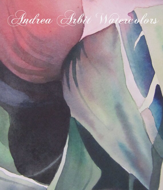
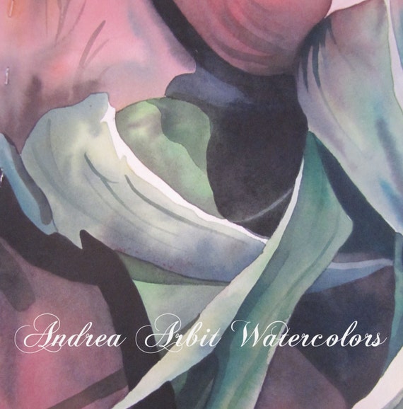
This painting was done in 2012 and features an extreme closeup of the stems, leaves, and the bottoms of pink rose petals of a few flowers in a rose bouquet. I chose to focus on the stems and leaves rather than the typical flower viewpoint to showcase parts of the plant that are often overlooked because they aren't as "beautiful." I wanted to show that there is still beauty in the lines and arcs of the stems and leaves, even though we often neglect to notice.
As with most of my artwork, this painting was created by looking at a source photograph I took of a rose bouquet. I played up the contrast by darkening the shadows so that it seems as if the roses are stepping out of the darkness and into the light. Several times larger in size than a real rose would be, the scale of the painting also adds to the drama.
This is for sale through my Etsy store.
"Rose Stems" -
Here are some details of the painting:
This painting was done in 2012 and features an extreme closeup of the stems, leaves, and the bottoms of pink rose petals of a few flowers in a rose bouquet. I chose to focus on the stems and leaves rather than the typical flower viewpoint to showcase parts of the plant that are often overlooked because they aren't as "beautiful." I wanted to show that there is still beauty in the lines and arcs of the stems and leaves, even though we often neglect to notice.
As with most of my artwork, this painting was created by looking at a source photograph I took of a rose bouquet. I played up the contrast by darkening the shadows so that it seems as if the roses are stepping out of the darkness and into the light. Several times larger in size than a real rose would be, the scale of the painting also adds to the drama.
This is for sale through my Etsy store.


