Exactly one month ago, as a five-day-early birthday present to myself, I finally got a tattoo! It's something that's been on my bucket list for several years, but I kept putting it off because I wasn't entirely sure what I wanted to get a tattoo of. I considered Harry Potter quotes for awhile - but there's too many good ones and not enough short good ones, and I didn't want an entire paragraph written on my skin. Then, I stumbled on pictures of floral "watercolor style" tattoos on Instagram several months ago, and that opened up an entirely new world of possibilities. I was really drawn to the idea of getting something pretty and artistic on the inside of my left forearm, near the inside of my elbow - something that would act as an extension to my body of artwork (floral, colorful, and heavy on the symbolism), and something that I would love and appreciate - and be able to see - every day.
But knowing that I wanted a colorful flower wasn't enough for me (of course). I wanted my tattoo to mean something more specific than just "a pretty flower" or "beautiful colors" or "a reference to my floral artwork". I carefully considered (as I do with much of my art) what the message of my tattoo should be - that is, what type of flower I should choose.
I settled on a dahlia flower because dahlias stand for a lot of cool things, including wisdom, creativity and art, drawing upon inner strength to succeed, maintaining kindness, grace and dignity in the face of adversity, embarking on new adventures, making positive life changes, and forging my own unique self-identity. They also symbolize a lasting commitment - and I don't know what's a more lasting commitment than a permanent tattoo. :) My dahlia tattoo is a promise I'm making to myself 1) to be kinder to myself (that is, to stop all self-abuse and negative thought patterns and start treating myself with the same kindness and respect I show my friends), and 2) to be unashamed and unafraid to be who I am, feel the things I feel, or want the things I want.
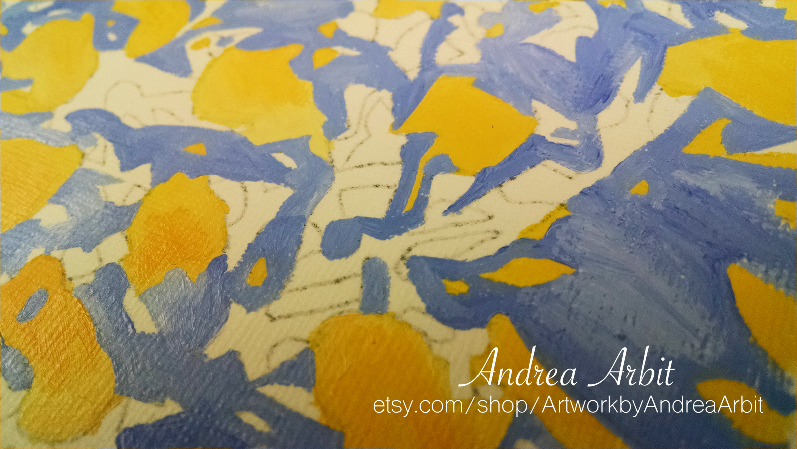
I designed the tattoo myself. I drew/traced several images of dahlias until I got one that I thought would work. I also played around with the amount of petals, cutting some of them away to simplify the flower a bit, given the size it would be on my arm. Then, I blew it up to 8x10 size (to make it easier to paint), traced it onto watercolor paper, and added some light watercolor washes, just to decided what colors I wanted to use and where I wanted those colors on the tattoo design.
I chose purple, blue, pink, and green for the colors. Purple is often associated with wisdom, elegance, intellect, depth, and beauty. Blue and green symbolize new life, fresh starts, and changes. The pink I added just because it's pretty - and I wanted a lighter color to make sure the darker purples and blues didn't make the tattoo too dark. These are also probably my four favorite colors (though I like so many colors, it does change a lot), and I have a lot of clothes in those colors, which will help my tattoo "go" with most of my wardrobe.
When the watercolor paint was dry, I went over the light pencil lines with a black Sharpie. Then, I used my copy machine to shrink it back down until it was the smaller size I wanted/the size that would fit on my arm.
The copier made the colors a lot duller, but I made sure to pick out with my tattoo artist the bright colors I actually wanted. I also told her I'd like to extend the extra pigment out further from the black outlines, to give it a more abstract/painterly quality. She used my to-scale copy to trace the design onto my skin, then inked the black outlines and the areas of color.
It hurt less than I thought it would, and went quicker than I thought it would too. It only took them about 1-1.5 hours to finish the tattoo. It also healed faster than I was told to expect, which was another nice bonus!
Here's what it looked like last week, three weeks after I got it:


It can be hard to get a good, clear picture of it... Not sure if that's the nature of this kind of tattoo, or just a problem specific to my phone camera (but I'm guessing probably the latter). :)
Now if only the weather would stop being so cold, maybe I'd actually be able to wear more short sleeves to show it off!
But knowing that I wanted a colorful flower wasn't enough for me (of course). I wanted my tattoo to mean something more specific than just "a pretty flower" or "beautiful colors" or "a reference to my floral artwork". I carefully considered (as I do with much of my art) what the message of my tattoo should be - that is, what type of flower I should choose.
 |
| Brand new tattoo! |
I settled on a dahlia flower because dahlias stand for a lot of cool things, including wisdom, creativity and art, drawing upon inner strength to succeed, maintaining kindness, grace and dignity in the face of adversity, embarking on new adventures, making positive life changes, and forging my own unique self-identity. They also symbolize a lasting commitment - and I don't know what's a more lasting commitment than a permanent tattoo. :) My dahlia tattoo is a promise I'm making to myself 1) to be kinder to myself (that is, to stop all self-abuse and negative thought patterns and start treating myself with the same kindness and respect I show my friends), and 2) to be unashamed and unafraid to be who I am, feel the things I feel, or want the things I want.
I designed the tattoo myself. I drew/traced several images of dahlias until I got one that I thought would work. I also played around with the amount of petals, cutting some of them away to simplify the flower a bit, given the size it would be on my arm. Then, I blew it up to 8x10 size (to make it easier to paint), traced it onto watercolor paper, and added some light watercolor washes, just to decided what colors I wanted to use and where I wanted those colors on the tattoo design.
 |
| The watercolor sketch before I added black outlines back in. |
I chose purple, blue, pink, and green for the colors. Purple is often associated with wisdom, elegance, intellect, depth, and beauty. Blue and green symbolize new life, fresh starts, and changes. The pink I added just because it's pretty - and I wanted a lighter color to make sure the darker purples and blues didn't make the tattoo too dark. These are also probably my four favorite colors (though I like so many colors, it does change a lot), and I have a lot of clothes in those colors, which will help my tattoo "go" with most of my wardrobe.
When the watercolor paint was dry, I went over the light pencil lines with a black Sharpie. Then, I used my copy machine to shrink it back down until it was the smaller size I wanted/the size that would fit on my arm.
 |
| Printing copies to try to figure out what size it should be on my arm. (The leaves point down to my wrist.) |
The copier made the colors a lot duller, but I made sure to pick out with my tattoo artist the bright colors I actually wanted. I also told her I'd like to extend the extra pigment out further from the black outlines, to give it a more abstract/painterly quality. She used my to-scale copy to trace the design onto my skin, then inked the black outlines and the areas of color.
It hurt less than I thought it would, and went quicker than I thought it would too. It only took them about 1-1.5 hours to finish the tattoo. It also healed faster than I was told to expect, which was another nice bonus!
Here's what it looked like last week, three weeks after I got it:


It can be hard to get a good, clear picture of it... Not sure if that's the nature of this kind of tattoo, or just a problem specific to my phone camera (but I'm guessing probably the latter). :)
Now if only the weather would stop being so cold, maybe I'd actually be able to wear more short sleeves to show it off!