Showing posts with label tools of the trade. Show all posts

Monday, May 6, 2019

Great Lakes - Dramatic Sky

I recently had someone purchase my watercolor painting "Dramatic Sky" from my Etsy shop, which was an assignment I completed several years ago for a watercolor studio class in college. This person also loved my "Great Lakes" watercolor paintings, and requested that I make a custom "Great Lakes" painting for them, in colors matching the "Dramatic Sky" painting they'd purchased.

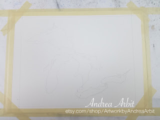
In this first picture, you can see the "Dramatic Sky" painting, which I kept and referred to for color reference while I painted the new piece, as well as the outline of the Great Lakes traced onto a new sheet of watercolor paper.


I taped down the new painting-to-be (to keep it stretched taut while I worked on its surface with paint and water), and dug through my watercolor collection to find tubes that I thought would best match my "Dramatic Sky" painting.


Because I painted "Dramatic Sky" so long ago, I didn't remember what specific colors I'd used, and had to guess.

There are two types of yellow I often use - one that's a warmer yellow and one that's a cooler yellow; for the "Dramatic Sky" piece, I was quite sure I'd used the cooler one, called "Lemon Yellow," which I'd favored more back in college and had since used less and less frequently. (In fact, I'd noticed just a month before this commission came in that I didn't even have any Lemon Yellow still in my box of watercolor tubes - which is why I'd included it on my holiday wish list this past December. Thankfully, my in-laws bought me one, so I had Lemon Yellow to work with again when I got this commission!)

For the greens and blues in the painting, I figured I'd used some mixture of Phthalo Green, Phthalo Blue, Hooker's Green, Viridian, and Ultramarine Blue. I got all of these tubes out so I could easily access them, and made sure they were all represented with fresh paint on my palette - though I may or may not have used all of them as I went. Hooker's Green in particular (a very dark green) I likely didn't end up using, instead going with the brighter Viridian, and getting the dark colors with dark blues instead.


The predominant color in my "Dramatic Sky" painting is a dark blue-green/teal, with just a little bit of brighter green, and even a smaller amount of Lemon Yellow. I tried to duplicate these proportions in the new "Great Lakes" painting as well, though ultimately ended up using more green than I had in "Dramatic Sky," just to add more visual contrast between the dark blue and somewhat lighter green.

Here is the finished painting below, still wet.


Once the painting was dry, I signed it and untaped it from the table. The person who commissioned this piece specifically requested that I sign it so that it did not look like a print, but an original painting. I always do this for my original paintings, often signing my "Great Lakes" paintings with my last name and date just under Lake Erie. For this piece, because of her request, I signed it slightly larger than I normally would have.


I love how this painting turned out. I think the dark blues and greens are very striking against the white paper, especially when paired with a matching white mat.


For comparison, here is the "Dramatic Sky" painting next to the finished "Great Lakes" piece. I packaged these two paintings together to save on shipping costs, and sent them along to the buyer.


I charge the same for a custom "Great Lakes" watercolor as I do for the ones I've already painted (which are for sale here in my Etsy shop). Each "Great Lakes" painting is $49 (not including shipping), and comes with a white mat.

Do you want a custom "Great Lakes" painting in a very specific color scheme to match another piece of artwork in your home, or a general color scheme for a particular room? Leave me a comment below, send me a message on Etsy, or email me at afrownfe@gmail.com. I love making custom pieces, and would love to work with you to create exactly what you envision! 


Friday, January 4, 2019

Organizing Art Closets

In the spirit of celebrating the New Year, I thought I'd share a recent organization project I completed for my finished artwork, invitation samples, frames and mats, and shipping and packing supplies.

Over the summer, my husband and I worked on organizing our second floor. We needed to clear out the "future nursery" bedroom - which we'd been using as an office/random storage room for the last six years - before we could paint it (a task I wrote about in this previous blog post). This entailed organizing our other extra bedroom-cum-office into a space that could house both our desks and computers, which in turn necessitated reorganizing all of my "art stuff" - something I'd truthfully been meaning to do anyway, so that I knew where to easily find finished artworks when something sold on Etsy.

I use a room in our basement as my in-home studio space - but the humidity levels are uncontrollable down there, which makes me worry that any artwork down there will warp a bit with time. I do still store all of my art supplies and artwork-in-progress in my basement studio, but I prefer to at least move my finished pieces up to the second floor, where the art will be safer. So over the course of several weeks last summer, I came up with a way to better organize my finished artwork, my supplies for framing and matting finished artwork, and my supplies for shipping finished artwork, utilizing our main hall closet upstairs as well as part of the closet in our guest bedroom.

Our guest room is occupied right now by my sister-in-law (and many of her things), who is in the process of moving back to Michigan and buying furniture so she can live in her newly purchased house - so I didn't grab a photo of the whole guest room closet, since she's using the closet rod to hang up her clothes. But there are two small sections of the closet that my finished artwork is living in - my larger pieces (many of them framed) in the right corner, leaning against the wall; and my mid-sized framed pieces (the pattern watercolors I grouped and installed into multi-opening frames) stacked in protective boxes horizontally in the left corner, coupled with smaller unframed pieces stacked in a box on a shelf above them (not pictured).


Then in our main hallway closet, we installed some new shelves, leaving an opening in the middle so that the attic hatch can still be accessed when needed. The floor has our suitcases and carry-on bags for travel, but the eight shelves above that hold items I use for my "art business" or graphic design business - including bubble mailers and envelopes, air bubble bags, bubble wrap, and packing paper on the top four shelves, which I use for shipping Etsy purchases domestically and internationally.


The two lower shelves on the left side house extra unused frames and mats for future finished artwork, as well as clear bags and boxes for my art print notecards. The clear bags fit one notecard and envelope; I deliver these individually priced notecards to Paint Creek Center for the Arts to add to their art market inventory. For my sets of 4, 6 or 10 notecards, I use the clear boxes. They're laying flat in the cardboard box, but they easily pop into a box shape and then stay closed with a small clear circle sticker when I'm ready to use them.


On the right side of the closet, the lower two shelves hold a plastic bin of past invitation projects and sample invitations, as well as extra brochures and business cards (with plenty more room to spare, as you can see).


Inside the plastic bin, I sorted past projects into their individual clear zip-sleeves. You can see my own personal wedding stationery in the top large sleeve in this first picture here. Keeping them in these individual sleeves helps me keep all the parts of one design together (invitations, save the dates, thank you cards, menus, ceremony programs, table numbers, place cards, etc.) for easy access when I want to refer to a past project or show samples to a future client.


Beneath all the plastic sleeves are stacks of sample invitations I created in 2011, before I had any "real client" projects to show off instead - invitations and other custom stationery with fake names at fake venues for fake events. They show the potential of what could be done to any future clients who want to utilize pocket envelopes.


The hallway closet obviously still has a lot of room to grow - allowing me to easily find space for more shipping or framing materials as I need to, or perhaps add another plastic bin of invitation projects stacked on top of this first one, once I complete more projects.

It's very convenient to have all of my finished artwork upstairs, as well as my "Invites by Andrea" samples and shipping and packing supplies next to my iMac and printer, where I work on graphic design projects and print notecard sets when someone makes an Etsy purchase. It doesn't always look nice (hello dented cardboard boxes, being reused for the third or fourth time) but it's effective, and that's what matters. :)

Friday, June 1, 2018

Varnishing Acrylic Paintings

I recently finished up my sister-in-law's Charlotte Skyline acrylic painting with an isolation layer and two layers of varnish, to help protect the three large canvases while they are shipped to her and on display in her apartment for years to come.

Because I had never done this step to an acrylic painting before, having only minimal experience with acrylic and using only making small paintings (or ones not even on canvas, but just on acrylic paper), I first had to buy the supplies.

I bought a new flat brush, Golden polymer varnish, and Golden soft gel gloss. (I also bought Golden soft gel matte, thinking I could use that as an isolation layer - only to later read on the label "DO NOT USE AS AN ISOLATION LAYER," at which time I went out and bought the soft gel gloss as a replacement.)

I used the Golden brand website to find instructions for how to apply the isolation layer and varnish layer. The directions were also on the labels.

I applied an isolation layer to my "test painting" first - "Find a Proverbial Mountain," the much smaller acrylic painting I completed in November 2016. I let that dry for a couple days, and then added a layer of varnish on top. When that painting survived just fine with no ill effects, I decided I was ready to try tackling the large skyline triptych.


Assembling my materials

Adding a layer of varnish to my painting

I followed the same procedure on the larger painting, following the directions on the label for ratio of soft gel gloss to water, and applying it in a thin isolation layer. It was white at first, but dried clear.


After I'd given that a couple days to dry, I went in with the polymer varnish (also diluted with water according to the label instructions). I did one coat to all three paintings, let it dry for 24 hours, and then added a second thin coat on top.


I then let it sit on my table for two weeks to make sure it was all fully dried and cured. I knew I would have to wrap the canvases in plastic and bubble wrap (not to mention packaging them in cardboard boxes) in order to ship them to North Carolina, so I wanted to make sure they were completely dry and ready before I did any of that.

They turned out great! And now I have the supplies on hand to do the same steps to any future acrylic paintings as well, to make sure they're all protected and will last a long time.

Tuesday, March 6, 2018

Charlotte Skyline In Progress (Adding Detail 1)

Once I had the first layers of paint down on my acrylic-on-canvas triptych, it was time to start adding more details.

But first, I wanted to do a bit more work on the sky, adding some lighter oranges, yellows, and purples to give it a nice sunset-y look. I used gel matte medium mixed into the paint to give it a translucent quality, so that the initial sky layers could still be seen through the paint. Then, I also added in some darker red/purples, when I thought the sky was looking too light.

Mixing different paints to get an orange color for the sky

Adding gel matte medium

Adding a layer of orange to the sky

Adding layers of yellow to the sky

A close up of the yellow layer

Adding some light purple/pink to the sky

Adding back in some darker red/purple shades

Then I started work on the buildings, starting with a skyscraper on the middle panel. When necessary, I darkened the main building color to better stand out against the sunset sky. I also added in lots of window details.

Using a paper plate as a paint palette

The first skyscraper, finished

Because the second skyscraper was on two different panels (mostly the middle panel, but with a little strip on the left most panel as well), I had to make sure to paint both at the same time, to line up the windows and make sure the colors were consistent throughout the building.

Starting the second skyscraper

Painting windows - even on the sides of the canvas

The second skyscraper finished

The third skyscraper had some challenges with the domed section of the roof, as well as some other architectural details at the top.


The finished third skyscraper

The first three skyscrapers together

I used different methods for different skyscrapers as I went along. Sometimes I painted in all the windows of one color first, then the windows of a different color, and then went through and fixed the lines/straightened the windows with the main building color. Other times I did this line by line instead of all at once.

For this fourth skyscraper, I put in all the windows first, then cleared up the lines and made everything crisper with a tiny paintbrush and paint the color of the main building background.


Roughing in the windows

Tidying it up

Don't forget the little building in the background!

The fifth skyscraper took awhile because it had lots of teeny tiny windows - much tinier than the windows on the other buildings I'd done so far. First, I decided to change the color of the building from the gray color I had it painted originally to more of a tan color. Then, I added in the details.


Making the building tan/brown

Adding in lots of tiny windows!

I'm enjoying this painting both for the scale and the subject matter. Very large works and architecture/human-made urbanscapes are not something I normally do - but it's nice to do something different every once in awhile. The geometric detail of the buildings is a nice change of pace from the organic/natural lines of most of my recent floral work.

More step-by-step in progress photos to come next week!

Tuesday, February 27, 2018

Charlotte Skyline in Progress (First Layer of Paint)


A couple weeks ago I posted about starting a Charlotte skyline acrylic painting for my sister-in-law, and the process that went into measuring and drawing out the skyline onto the three 22"x28" canvases. I've been working hard on the painting now, and today I'd like to show the step-by-step photos of how I began the layers of acrylic paint.

I had to purchase some more paints for this endeavor (and have since purchased even more, when I started running out of colors I didn't expect to run out of). First, I laid out all the colors I thought I'd use - setting them out on another table, since the three canvases side by side already take up my entire large table that I use in my art studio.


I put down the colors of the sky first, blending colors together as I went to create a looser, atmospheric look. These are the colors I chose for the sky, followed by what my palette (a paper plate) looked like after I was finished brushing the colors onto the sky.


And here is the dark, sunset sky, after that first layer of paint. It was extra shiny while it was still wet.


Once the sky was in place, I started painting in the buildings. I planned to go back and add lots of details (and color) later, so I wasn't concerned with getting the buildings exactly the right color yet. I just wanted them all blocked off with about the right color (or at least the right shade), so that I could tell the buildings apart from each other and have a good foundation to work with.


Now the first layer of acrylic is complete! All of the canvas is covered with at least a bit of paint - even the tops, bottoms, and sides of the canvas (which will be visible if they are hung directly as-is on the wall).

I will post again soon with some more pictures of the next step in this process. :)