Showing posts with label metallic. Show all posts

Tuesday, February 20, 2018

Custom Name Paintings (Athena)

Besides the two paintings I made for friends who got married last year, I also made a single-name custom artwork for my cousin, who gave birth to a baby girl named Athena in December. I created this painting with a fun purple and metallic gold color scheme, to play up the royal/goddess origins of her baby's name.

As with my other paintings, I first traced the name onto paper and then taped the paper to my work table.


For this one, I chose to keep the letters white (the color of the paper), so I painted around the outlines I'd traced. I used highly pigmented purple and metallic gold inks in addition to purple, pink and yellow watercolor paint for this piece.


The above pictures were taken while the painting was still wet. Once it was dry, there were some interesting abstract watermarks that remained on the paper, giving it an authentic, artistic look.


Here is the finished painting, in a gray frame:


On the back of the painting, I wrote:


If you would like to order a custom name painting like this to gift to someone in your life, you can check out this Etsy listing in my shop!

Sunday, January 21, 2018

Bathroom Color Scheme & Artwork

A big project we undertook in 2017 was to have our guest bathroom renovated. This is the nicest, largest bathroom of our house, but one that doesn't often get used (yet). We also have a powder room on the main floor and a small bathroom off the master bedroom (which just has a standing shower - not a tub). We replaced the toilets and vanities in each of the three bathrooms, and completely overhauled the large guest bathroom with new tile, new cabinets and counters, new sinks and faucets, a new tub, new lighting, new toilet, new mirrors, and new paint color. With the exception of the paint color, which we did ourselves, we had a company in our town manage the project. It took twice as long as they originally estimated, putting us out for two months - but the end result is beautiful!

I wanted a gray/white/purple color scheme, with white tile, sinks, tub, and toilet, medium/dark gray cabinetry, and purple walls. I had them lay the square floor tiles diagonally, and the matching "subway" style shower tile in a herringbone pattern - because I love how dynamic those lines look when they aren't set up in the typical boring parallel/perpendicular way.

For the paint color, I didn't want to go too "girlie" with the purple color - but I still wanted something bright as a contrast to the neutral white/gray everywhere else in the bathroom. I tried to pick a purple that had some gray in it, and one that was also light enough that it didn't make this windowless bathroom too dark - since the gray cabinets already added to the darkness.

Finally, I finished up the bathroom with some matching purple rugs and towels, and by creating a custom piece of art for the wall.

And now (since you're dying to see them, I'm sure!), here are the photos!

Before the renovation:


At the start of the renovation, after they tore everything out:


The finished room - with awesome tiles and more cabinet space!


I decided that I needed some vertical artwork for the wall near the bathroom/tub, and when I couldn't find anything in the colors/style I wanted to, I made it myself.

I picked out a white frame that would hold four small paintings. Then, using some small pieces of paper torn from a watercolor sketch book, I went about making the paintings. Even though my frame would only hold four, I made six small pieces - knowing that some would turn out better than others, and that I would want options to choose from.

I wanted to do an abstract style, and I wanted to incorporate the white of the tub, toilet, tile and counters, the light gray veins in the tile and counter, the color of the darker gray cabinetry, the color and shiny chrome texture of the silver faucets, towel racks, and lighting fixtures, and a nice purple to go with the purple color we painted the walls. I also really liked the abstract leaf-print shower curtain we found (which had simple leaf-shapes in shades of purples and grays), and wanted to incorporate some leaf-like shapes into the design as well.

I taped down my six small pieces of paper with masking tape, so they wouldn't curl up too much when I got them wet with paint.


For the first layer, I used black India ink, super pigmented purple ink, and iridescent acrylic medium - which you would usually mix with acrylic paint, but which I just used straight from the jar for a sparkly/metallic look.


Then, I just went to town. I layered wet washes of ink with thinner brush strokes. I used the iridescent medium to just smear some areas with shine, and I used the black and purple inks to write/draw curvy lines and the hints of some leaf shapes.

I threw some cotton makeup rounds on there just to soak up some extra moisture while they were drying.


For the next layer, I used white pastel chalk, metallic silver and pink markers, and a thinner metallic silver pen to "collage" more leaf-shapes onto the paintings, and add visual interest.


Once I was satisfied and everything was dry, I pulled the masking tape off and chose which four of the six I would put in my frame.


Here's the final piece hanging in the bathroom!


I had a lot of fun "experimenting" with the abstract style for the artwork, and playing around with some art materials I don't usually use. It's exactly what I wanted to finish off our new bathroom.

Do you have a space that needs some custom artwork? I'd love to help you out! Leave a comment below or send me an email at afrownfe@gmail.com to let me know what you're thinking of. :)


Tuesday, January 9, 2018

Christmas Card Design

Every year my mom commissions me to create a design for their Christmas cards. Last year, it was "Little Drummer Boy" themed, in memory of my grandfather who passed away in 1996. This past Christmas season, my mom wanted an angel theme, in memory of my grandma who passed away in July 2017. Because my grandma lived with my parents, the last few years the Christmas cards have been signed by my parents, my brother, and my grandma - this would be the first Christmas since my grandma moved in with them in 2014 that the cards were coming from only my parents and brother again.

My mom wanted the front of the cards to say "Gloria in Excelsis Deo," with a verse from that Christmas hymn on the inside of the card.

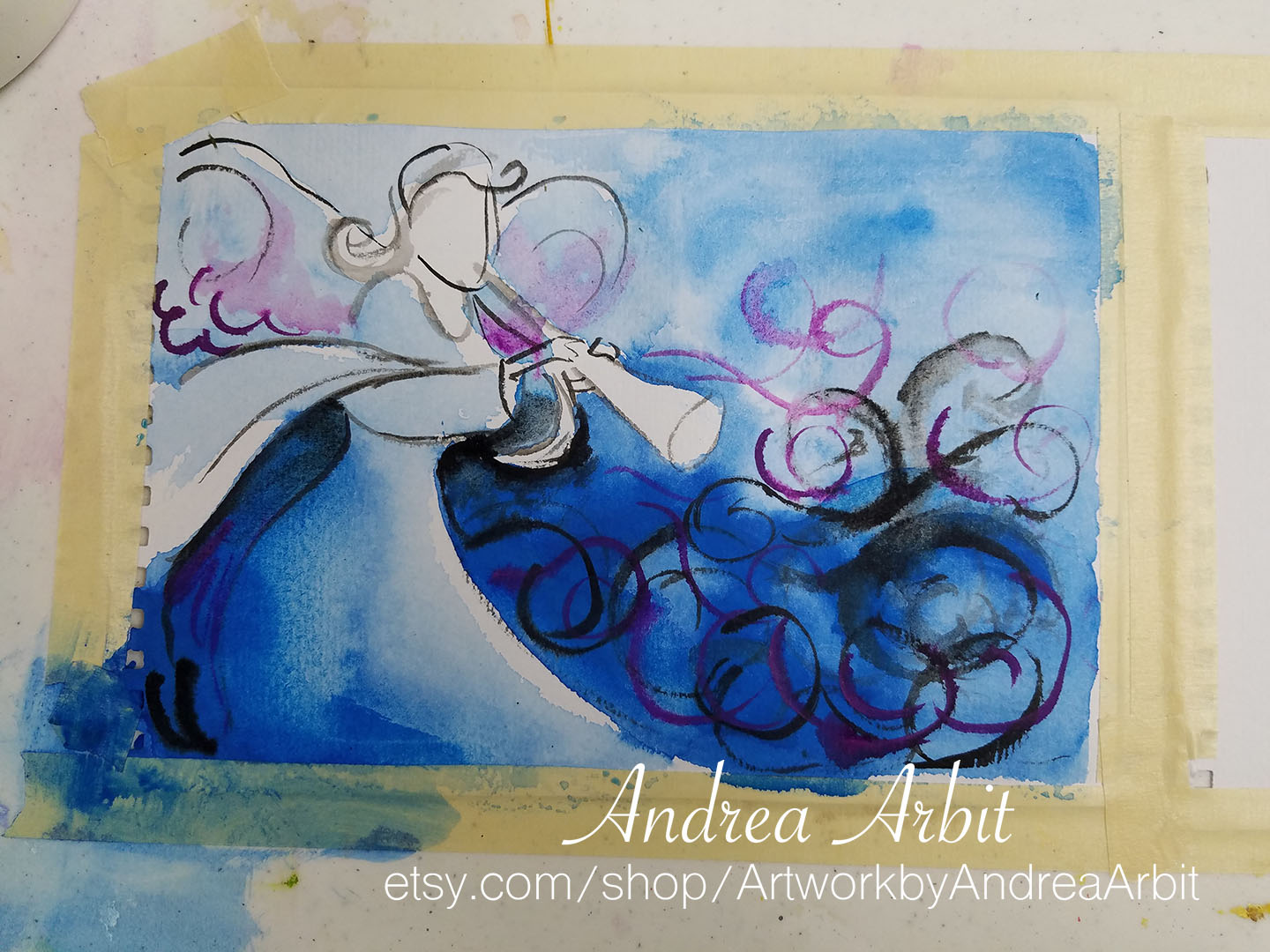
I already had various inks and markers out from a previous art project (which I'll make a blog post about next!), so because I had those materials already on hand, I appropriated them for this Christmas card as well. I used black India ink, and high pigment blue and purple inks to start the design:


I then added some metallic gold ink. Once that was dry, I added more details with black Sharpie.


Then, I scanned in this mini-painting I'd created, resized it to fit on a card, and faded it into a lighter background. I reincorporated some of the abstract background swirls in the upper right corner of the design, as well.

I used Adobe Illustrator to add in the text and set it up to print as notecards.


Here is the inside of the card, and the back of the card:


I printed all of the cards for them as I print my typical art notecards. Then, I printed address labels, stuffed envelopes, labeled them, stamped them, and mailed them out in early/mid-December.


I can create custom holiday cards for your family, too! Email me at afrownfe@gmail.com for pricing and other information.

Thursday, July 6, 2017

More New Great Lakes Watercolors

I painted eight "Great Lakes" watercolors recently, four of which I shared photos of in yesterday's post. Today, I'll show the last four - including the metallic and rainbow color schemes I'd been planning.

All eight of these original paintings are for sale in my Etsy shop.

Here are the photos of the process, where I used masking tape to keep the watercolor paper flat on the table while I painted.

These four are titled "Pink & Orange," "Green, Pink & Yellow," "Metallic Copper & Red," and "Rainbow."


-

"The Great Lakes in Pink, Green & Yellow" is for sale on Etsy here.

I love how these three bright colors together are reminiscent of tie-dye.


-

"The Great Lakes in Pink & Orange" is for sale on Etsy here.

I used analogous colors pink, orange and yellow for this watercolor painting.


-

"The Great Lakes in Metallic Copper & Red" is for sale on Etsy here.

I used Daniel Smith iridescent watercolors in Aztec Gold and Red for this painting. There is a lot of metallic shine, giving it a slightly different color in different lighting/at different angles.


-

"The Great Lakes Rainbow" is for sale on Etsy here.

I used pink, red, orange, yellow, green, blue, and purple pigments for this painting, making a spectrum from the west tip of Superior through to the east end of Lake Ontario.


-

These paintings are also available as notecard art prints, which you can find in my Etsy store here. I will post pictures of these notecards in tomorrow's post.