Awhile ago I bought a pack of seven 12"x12" stretched canvas from Michaels while they were having a sale. Then, I remembered that I had several 12"x12" designs already created on my computer from a few years ago - compositions that combined patterns and flowers in Adobe Photoshop.
I made these designs to work as digital scrapbook paper; I had thoughts of printing my own 12"x12" scrapbook paper to sell, and in 2014 specifically bought a large format printer that could print up to that size. Unfortunately, the printer had a lot of issues, including NOT being able to print the size I wanted, or print on any of the cardstock types I wanted to print on, and I ended up returning it to the store and investing in a different type of printer instead.
But I still have several 12"x12" digital designs that I'd already created with scrapbooking in mind, and they're just sitting on my computer waiting to be used somewhere. I looked through them, selected my favorite seven (or the seven that I thought would best translate to acrylic) and am now trying to "recreate" these digital collages as a square acrylic painting on canvas.
Each painting will have a different "main" color. This first one is yellow, and the subject matter is black eyed susans. In fact, I think most of the black eyed susan imagery I used in the digital collage came from the same black eyed susan photo that I used for This Busted World in my recent Cloud Atlas Sextet Series - but I feel okay about "reusing" this source material again, because the general color scheme, composition, and painting style are very different between the two works.
Here is This Busted World:
And here is the new painting I am working on:
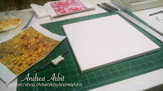
On the left, you can see the printout of the composition. The background is yellow, with some blurry black stripes. Black eyed susans float around and through the background in different transparent or opaque layers. And yellow and black lines of pattern work their way over and under the flowers, integrating into the petals.
I did not want to trace the exact design onto the canvas to create this painting, as I did for This Busted World and the others in that series. I wanted to use more variations in tone rather than just picking four colors, and I wanted a generally looser style. So to start, I only drew a faint sketch onto the canvas of where the main flowers would be placed. Then, I just dived in and started painting.
First, I added color to the background:


Then, I made sure to mark the dark centers of the flowers so that I could keep track of them as I added more and more layers.


I added some orange shadows:
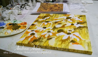

And some green ones:


And then I started filling in the petals:


This is basically the "first layer" of the piece. Now that I have (most of) the canvas covered in paint, I can go back in and add dimension and depth, flower by flower. I try to work on it a couple hours a week (squeezing this "side project" in between working on editing my novel and planning for a large colored pencil drawing I'll be starting soon), and hope to be finished with it by the end of August.
It is still keeping its "loose" style so far, but I don't know how long that will last. I tend to "overwork" things - or maybe I just prefer things to look exact, detailed, intentional, and clean, because that's how my paintings usually end up. We'll see how this one goes!
Oh - and it's name is Find a Proverbial Mountain. I wanted to make sure to give them all titles early this time, so that I can make the paintings go with the titles as I work; rather than deciding on a title at the end.
I've gotten several likes on the pics I've posted on Instagram of this painting so far:


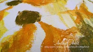
In this last pic, you can see how I've started to add some dimensionality into the top right flower and the background around it, giving it a more 3D look.
Lots of work still to do, but it's starting to get there!
I made these designs to work as digital scrapbook paper; I had thoughts of printing my own 12"x12" scrapbook paper to sell, and in 2014 specifically bought a large format printer that could print up to that size. Unfortunately, the printer had a lot of issues, including NOT being able to print the size I wanted, or print on any of the cardstock types I wanted to print on, and I ended up returning it to the store and investing in a different type of printer instead.
But I still have several 12"x12" digital designs that I'd already created with scrapbooking in mind, and they're just sitting on my computer waiting to be used somewhere. I looked through them, selected my favorite seven (or the seven that I thought would best translate to acrylic) and am now trying to "recreate" these digital collages as a square acrylic painting on canvas.
Each painting will have a different "main" color. This first one is yellow, and the subject matter is black eyed susans. In fact, I think most of the black eyed susan imagery I used in the digital collage came from the same black eyed susan photo that I used for This Busted World in my recent Cloud Atlas Sextet Series - but I feel okay about "reusing" this source material again, because the general color scheme, composition, and painting style are very different between the two works.
Here is This Busted World:
 |
| "This Busted World" - 8"x10" Acrylic on Paper |
And here is the new painting I am working on:

On the left, you can see the printout of the composition. The background is yellow, with some blurry black stripes. Black eyed susans float around and through the background in different transparent or opaque layers. And yellow and black lines of pattern work their way over and under the flowers, integrating into the petals.
I did not want to trace the exact design onto the canvas to create this painting, as I did for This Busted World and the others in that series. I wanted to use more variations in tone rather than just picking four colors, and I wanted a generally looser style. So to start, I only drew a faint sketch onto the canvas of where the main flowers would be placed. Then, I just dived in and started painting.
First, I added color to the background:


Then, I made sure to mark the dark centers of the flowers so that I could keep track of them as I added more and more layers.


I added some orange shadows:


And some green ones:


And then I started filling in the petals:


This is basically the "first layer" of the piece. Now that I have (most of) the canvas covered in paint, I can go back in and add dimension and depth, flower by flower. I try to work on it a couple hours a week (squeezing this "side project" in between working on editing my novel and planning for a large colored pencil drawing I'll be starting soon), and hope to be finished with it by the end of August.
It is still keeping its "loose" style so far, but I don't know how long that will last. I tend to "overwork" things - or maybe I just prefer things to look exact, detailed, intentional, and clean, because that's how my paintings usually end up. We'll see how this one goes!
Oh - and it's name is Find a Proverbial Mountain. I wanted to make sure to give them all titles early this time, so that I can make the paintings go with the titles as I work; rather than deciding on a title at the end.
I've gotten several likes on the pics I've posted on Instagram of this painting so far:


In this last pic, you can see how I've started to add some dimensionality into the top right flower and the background around it, giving it a more 3D look.
Lots of work still to do, but it's starting to get there!