Wednesday, August 26, 2020

"Hostility" Colored Pencil Drawing

This 8"x10" colored pencil drawing is (just like the last) on Strathmore black paper with Prismacolor brand pencils. The flowers depicted are tansy, and they symbolize "hostility."

I started by sketching out where the tansy flowers would go on the page, along with some of the texture (in the first couple flowers) just so I could get an idea of how it might look like. Tansy are yellow, but yellow pencil doesn't show up great on black paper on its own, so I started with white, planning to layer yellow in on top of the white later. 


After I had the flowers placed, I sketched in some leaves and stems for the background. Tansy has a really interesting texture, so I wanted to have the leaves large (taking up just as much of the composition as the tansy), so that the two juxtaposed next to each other would really draw attention to the differences in texture.

I then finished coloring in the white underlayer of dots for the tansy.


I added texture to the leaves next, using white and yellow for the highlights, as well as two different shades of green.


I added some red to the leaves in areas of shadow, and then moved on to the tansy, where I colored over the white colored pencil dots with yellow, using red and navy blue for shadows.


Here are some close-ups of the completed drawing:


Wednesday, August 19, 2020

"Reservation" Colored Pencil Drawing

This recent 8"x10" colored pencil drawing is of "4 o'clock flowers" - so named because they open up every day around 4 o'clock in the afternoon. Since they only open up briefly every day, they symbolize reservation (a.k.a. shyness - not the booking you might make at a local restaurant). I used Strathmore black paper and Prismacolor brand colored pencils to complete this drawing.

First, I started with a light sketch of where the flowers would go on the paper, marking out which colors I wanted to go where.


Then, once I had my plan in place, I started going through and adding depth and dimension. On black paper, you make something lighter and brighter by adding more pigment (to contrast it against the black), so the more layers I added the brighter the flowers looked. Areas I wanted to remain darker or in shadow I added less colored pencil to, so they would let more of the black paper show through.

Prismacolor pencils are great at blending colors together, which was perfect for the flowers that had multiple colors on one petal - like the first flower I did below, which was both pink and white.


Once I had all the flowers colored in lighter and brighter, I started adding detail to the background as well, highlighting certain leaves and stems where the light would hit, and leaving others in shadow.


I'm very excited how this one turned out! The pinks, yellows, oranges, and whites pop so well against the black paper, and are just the colors to bring some beauty to what has been, for many, a really tough year.


Here are some close-up shots of the finished drawing:


Tuesday, August 11, 2020

Pattern Rubena in Yellow-Green

This is another 8"x10" watercolor painting that I finished back in December 2019 but am only just now getting around to posting on here.

In this first picture, you can see how I start each painting - by taking a design I created digitally with Adobe Illustrator, and tracing it onto watercolor paper, taping it down to the table so the paper will stay flat while I paint.


Then, I begin painting. For this one I used a lemon yellow and light green color scheme.


Once finished, I untapped the painting. It can be hung horizontally or vertically in either direction (since it's totally abstract and non-representational, and the front is unsigned), and once framed, it's ready to hang!


Interested in owning this painting (or something similar)? Check out all the patterned watercolor options in my Etsy shop. :)

Tuesday, August 4, 2020

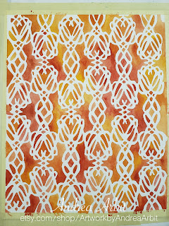
Pattern Genevra in Red-Orange

This 8"x10" watercolor painting was finished back in December 2019, one of a series of final watercolors I completed in the last weeks leading up to the birth of my baby. I'm just now getting around to posting it here because, you know... baby showed up. :)

As with all of my patterned watercolors, I started with a design I'd created digitally with Adobe Illustrator. I traced the design onto watercolor paper with pencil, and then started painting. This one uses an orange and red color scheme.


Once the painting was finished and dry, I untaped it, matted it, and framed it so that it would be ready to hang. Because the subject is totally abstract/non-representational, and the front is unsigned, it can be hung horizontally or vertically in either direction.


I love creating these patterns, and painting them as watercolors. I find them so contemplative, meditative, and relaxing to look at once they're all finished. If you love them too, you can find several similar options in my Etsy shop. :)