I recently had someone purchase my watercolor painting "Dramatic Sky" from my Etsy shop, which was an assignment I completed several years ago for a watercolor studio class in college. This person also loved my "Great Lakes" watercolor paintings, and requested that I make a custom "Great Lakes" painting for them, in colors matching the "Dramatic Sky" painting they'd purchased.
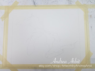
In this first picture, you can see the "Dramatic Sky" painting, which I kept and referred to for color reference while I painted the new piece, as well as the outline of the Great Lakes traced onto a new sheet of watercolor paper.

I taped down the new painting-to-be (to keep it stretched taut while I worked on its surface with paint and water), and dug through my watercolor collection to find tubes that I thought would best match my "Dramatic Sky" painting.
Because I painted "Dramatic Sky" so long ago, I didn't remember what specific colors I'd used, and had to guess.
There are two types of yellow I often use - one that's a warmer yellow and one that's a cooler yellow; for the "Dramatic Sky" piece, I was quite sure I'd used the cooler one, called "Lemon Yellow," which I'd favored more back in college and had since used less and less frequently. (In fact, I'd noticed just a month before this commission came in that I didn't even have any Lemon Yellow still in my box of watercolor tubes - which is why I'd included it on my holiday wish list this past December. Thankfully, my in-laws bought me one, so I had Lemon Yellow to work with again when I got this commission!)
For the greens and blues in the painting, I figured I'd used some mixture of Phthalo Green, Phthalo Blue, Hooker's Green, Viridian, and Ultramarine Blue. I got all of these tubes out so I could easily access them, and made sure they were all represented with fresh paint on my palette - though I may or may not have used all of them as I went. Hooker's Green in particular (a very dark green) I likely didn't end up using, instead going with the brighter Viridian, and getting the dark colors with dark blues instead.

The predominant color in my "Dramatic Sky" painting is a dark blue-green/teal, with just a little bit of brighter green, and even a smaller amount of Lemon Yellow. I tried to duplicate these proportions in the new "Great Lakes" painting as well, though ultimately ended up using more green than I had in "Dramatic Sky," just to add more visual contrast between the dark blue and somewhat lighter green.
Here is the finished painting below, still wet.


Once the painting was dry, I signed it and untaped it from the table. The person who commissioned this piece specifically requested that I sign it so that it did not look like a print, but an original painting. I always do this for my original paintings, often signing my "Great Lakes" paintings with my last name and date just under Lake Erie. For this piece, because of her request, I signed it slightly larger than I normally would have.


I love how this painting turned out. I think the dark blues and greens are very striking against the white paper, especially when paired with a matching white mat.


For comparison, here is the "Dramatic Sky" painting next to the finished "Great Lakes" piece. I packaged these two paintings together to save on shipping costs, and sent them along to the buyer.

In this first picture, you can see the "Dramatic Sky" painting, which I kept and referred to for color reference while I painted the new piece, as well as the outline of the Great Lakes traced onto a new sheet of watercolor paper.

I taped down the new painting-to-be (to keep it stretched taut while I worked on its surface with paint and water), and dug through my watercolor collection to find tubes that I thought would best match my "Dramatic Sky" painting.

Because I painted "Dramatic Sky" so long ago, I didn't remember what specific colors I'd used, and had to guess.
There are two types of yellow I often use - one that's a warmer yellow and one that's a cooler yellow; for the "Dramatic Sky" piece, I was quite sure I'd used the cooler one, called "Lemon Yellow," which I'd favored more back in college and had since used less and less frequently. (In fact, I'd noticed just a month before this commission came in that I didn't even have any Lemon Yellow still in my box of watercolor tubes - which is why I'd included it on my holiday wish list this past December. Thankfully, my in-laws bought me one, so I had Lemon Yellow to work with again when I got this commission!)
For the greens and blues in the painting, I figured I'd used some mixture of Phthalo Green, Phthalo Blue, Hooker's Green, Viridian, and Ultramarine Blue. I got all of these tubes out so I could easily access them, and made sure they were all represented with fresh paint on my palette - though I may or may not have used all of them as I went. Hooker's Green in particular (a very dark green) I likely didn't end up using, instead going with the brighter Viridian, and getting the dark colors with dark blues instead.

The predominant color in my "Dramatic Sky" painting is a dark blue-green/teal, with just a little bit of brighter green, and even a smaller amount of Lemon Yellow. I tried to duplicate these proportions in the new "Great Lakes" painting as well, though ultimately ended up using more green than I had in "Dramatic Sky," just to add more visual contrast between the dark blue and somewhat lighter green.
Here is the finished painting below, still wet.


Once the painting was dry, I signed it and untaped it from the table. The person who commissioned this piece specifically requested that I sign it so that it did not look like a print, but an original painting. I always do this for my original paintings, often signing my "Great Lakes" paintings with my last name and date just under Lake Erie. For this piece, because of her request, I signed it slightly larger than I normally would have.


I love how this painting turned out. I think the dark blues and greens are very striking against the white paper, especially when paired with a matching white mat.


For comparison, here is the "Dramatic Sky" painting next to the finished "Great Lakes" piece. I packaged these two paintings together to save on shipping costs, and sent them along to the buyer.

I charge the same for a custom "Great Lakes" watercolor as I do for the ones I've already painted (which are for sale here in my Etsy shop). Each "Great Lakes" painting is $49 (not including shipping), and comes with a white mat.
Do you want a custom "Great Lakes" painting in a very specific color scheme to match another piece of artwork in your home, or a general color scheme for a particular room? Leave me a comment below, send me a message on Etsy, or email me at afrownfe@gmail.com. I love making custom pieces, and would love to work with you to create exactly what you envision!
No comments:
Post a Comment