Thursday, April 26, 2018

NYC Photos - Skyscrapers

My husband and I recently went on a trip to New York City - my first time ever in the Big Apple! For someone who has always loved theater and art, NYC has always been on my bucket list in a big way. Because I wanted to see everything, we went for eight days/nine nights (the concierge at our hotel was shocked how long we were staying!), and we made a plan to ensure we went to everything we wanted to do.

We took tours - the Circle Line Landmark Tour, which is a boat tour around the harbor; the NBC Studio Tour inside Rockefeller Center; the Statue Cruise boat out to Ellis Island; a tour of the New York Public Library; and an audio tour of Grand Central Terminal. We visited museums - the Metropolitan Museum of Art (the Met), the Museum of Modern Art (the MoMA), the Tenement Museum, the Jewish Museum, and the Ellis Island Museum. And we took in shows - an improv show at the United Citizens Brigade, the off-Broadway "Puffs" (a Harry Potter spoof play that was hilarious), "Avenue Q" (a fabulous puppet-musical off-Broadway), and the Broadway show "Lobby Hero," starring Michael Cera, Chris Evans, Brian Tyree Henry, and Bel Powley.

We also walked around several iconic neighborhoods including Hell's Kitchen/Chelsea (especially the High Line park), Chinatown/Little Italy/the Lower East Side/SoHo, the Financial District/Lower Manhattan, NoHo/Greenwich Village, just a bit of Brooklyn, Central Park, and Midtown/the Theater District (the last several times, as that's where our hotel was located).

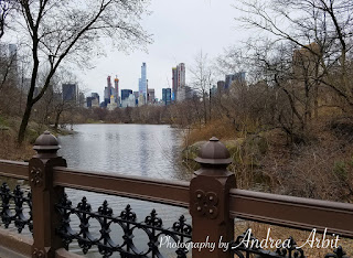
The weather didn't always cooperate. We were there from March 30-April 7, and during that week we saw rain, mist, fog, snow, wind, and a little bit of sun. (I had been hoping to avoid most of the snow/cold by early April, but apparently we should have booked the trip for a few weeks later - winter has really been holding on this year!) Still, we managed to do most of what we wanted to do, even if I had to take photos of the Manhattan skyline in the fog, instead of in the sun.

I took over 2,000 photos over the time we were there, and I'm not going to post them all on this blog. But I am going to post a lot of them, over the course of several days/weeks. Today, I'm focusing on the best pictures I took of skyscrapers - those iconic NYC buildings that make up the famous skyline. I plan to use at least some of these pictures for future artworks.




Monday, April 23, 2018

"Fertility" Colored Pencil Drawing

You can purchase this finished drawing here in my Etsy shop.

The next 8"x10" colored pencil drawing in my symbolic flower series is "Fertility" - also on red Canson Mi-Teintes paper. I named it "Fertility" because the flowers are from the pomegranate plant, whose flowers and fruit symbolize fertility in many religions and cultures, in large part due to the vast number of seeds found inside the ripe fruit.

I started, as usual, with a light layer to get the placement of the flowers down. I couldn't find one image I wanted, so I printed out two pictures from Google, and then used them as a reference and combined them to make my drawing.


Once the initial layer was in place, I went through and added more detail and dimension, starting with the group of smaller flowers in the upper right, then working my way to the left, and finishing with the leaves in the lower right corner.


Here's the finished drawing. This paper is larger than 8"x10" size (it's actually 9"x12"), so when it gets matted down to 8"x10" later, it'll be much closer cropped, and there won't be as much red paper visible along the edges.


You can purchase this finished drawing here in my Etsy shop.

Friday, April 20, 2018

"Ambition" Colored Pencil Drawing

You can purchase this finished drawing here in my Etsy shop.

Hollyhock flowers symbolize many things including "ambition," which I chose to use for the title of this 8"x10" colored pencil drawing. I used Prismacolor brand pencils and Canson Mi-Tientes red paper, as well as a source photograph of hollyhock I printed from Google, to draw this piece.

This first picture shows me collecting my supplies. In the upper right you can see the printout of hollyhock I used for reference as I drew.


I made a quick linear outline for how I wanted the flowers placed on the paper.


Then I started lightly coloring in the flowers and leaves.


Once I had that initial layer in place, I started going back through and adding more detail and dimension. I started with the green stems and leaves, which I suspected might be a little tricky to get the shading how I wanted it, given that I was drawing on red paper and green and red are complementary colors. I had to make sure to choose an appropriate green so that it would both show up against the red, and not cause too much visual vibration where it touched red/where the red paper showed through.


Then I went through and added more color, detail, and dimension to the flowers. There are a few different colors of hollyhock in this drawing.


And here's the finished piece! Close-up views show quite a bit of the texture of the Canson Mi-Tientes paper, which I think gives it a nice, rich, artistic quality.


You can purchase this finished drawing here in my Etsy shop.

Tuesday, April 17, 2018

Symbolic Floral Colored Pencil Series

Last year, I made a few quick 8x10 colored pencil drawings before the November GRRRLS Like Us exhibition at the Village Theater in Canton, which I gave single-word names like "Endurance", "Anticipation", and "Shame."

"Endurance" 8x10 Colored Pencil Drawing by Andrea Arbit

These were part of what I envisioned as a much larger series, ultimately using the three colors of paper I have often used for colored pencil drawings in the past (black paper, toned tan paper, and gray paper), as well as four new, bright colors that I'd ordered from Dick Blick several months ago but hadn't yet experimented with (red, blue, yellow-orange, and green). 

I have a spreadsheet that lists ideas for 70 total drawings, including the three I've already made - ten drawings for each of the 7 different colors of paper. This could theoretically be expanded (as long as there are more different flowers I can think of to include, and more paper to buy!), but 70 is plenty for now. Each one takes me about a week to complete, which makes them easy to fit in between or do concurrently with other art projects, but they still do take time. I'm hoping to complete somewhere around 14-16 more before the end of 2018, depending on how busy I get with other things. (I also have plans for more acrylic paintings in the works, and I often get an Etsy order for a custom watercolor bouquet painting about once a month, especially during the spring and summer when a lot of couples have wedding anniversaries!)

"Anticipation" 8x10 Colored Pencil Drawing by Andrea Arbit

Each drawing will feature one type of flower/plant, and be given the title of one of the things the flower symbolizes. So for the ones I've already completed, I titled my drawing of succulents on black paper "Endurance", my drawing of anemones on tan paper "Anticipation", and my drawing on peonies on tan paper "Shame". 

The next several drawings I plan to do include:
  • Hollyhock on red paper, titled "Ambition" *
  • Pomegranate flowers on red paper, titled "Fertility" *
  • Birds of Paradise on blue paper, titled "Flight"
  • Pink Hyacinth on blue paper, titled "Playfulness"
  • Heliotrope on gray paper, titled "Prophecy"
  • Daisy on gray paper, titled "Loyalty"
  • Sunflower on yellow paper, titled "Nourishment"
  • Bouvardia on yellow paper, titled "Enthusiasm"
  • Protea on green paper, titled "Transformation"
  • Button Pom on green paper, titled "Hope"
  • Bluebell on tan paper, titled "Constancy"
  • Thyme on tan paper, titled "Strength"
  • Black Eyed Susans on black paper, titled "Justice"
  • Petunia on black paper, titled "Resentment"
* If you follow me on Instagram, you may have already seen these first two drawings. I finished them last month and posted a couple images of each then (this blog is often behind "real time"). Blog posts of the in-progress pics of those drawings will come later this week.

These are not attributes I've created, but rather symbolism that was widely used in Victoria England or other historical eras, and easily researched/found in charts of flower symbolism on the internet. Some are more positive sounding than others, of course; one of the drawings I most often received remarks about at the GRRRLS Like Us exhibition was "Shame" - people couldn't understand why I called it that, why peonies would be associated with shame, or who would want to buy and display a drawing of "Shame" in their home, beautiful though the drawing may be. 

"Shame" 8x10 Colored Pencil Drawing by Andrea Arbit

When I give a drawing a title like "Shame" (or "Endurance" or "Anticipation"), people look at it longer and try to figure out why it has that name. Sometimes there's a pretty clear biological connection (succulents are very enduring plants, which can survive with little water) or a clear visual connection (like how drooping red amaranthus plants, also called "love lies bleeding", symbolize sacrifice), but other times the title might leave people continuing to wonder why long after the first look. Why indeed did Victorian England poets and florists decide peonies should stand for shame? Furthermore - does it really matter? Who cares what they supposedly symbolize if you find them pretty? 

My inclusion of such words with negative connotations in this series is in part to point out the arbitrariness of some of these established symbols. I think the titles give a little extra substance to the drawings, but at the end of the day, they're still just titles. You can decide how much weight to put on the title of the work - or how much weight to give the drawing itself. You can decide if the title fits, or seems incongruous. It's just another layer to the drawing - one that doesn't even show up anywhere on the drawing itself. It's not like the word "Shame" is written across the drawing in big, bold letters. :)
I think the titles are interesting (I wouldn't use them otherwise), but really this series, like many of my projects, is just an excuse to what I want to make - pretty floral drawings (that have mass appeal and can be easily scanned and used for art prints or notecards) on pretty colored paper. Those bright Canson Me-Teintes color packs I bought from Dick Blick have been sitting on shelves in my studio for far too long, and I've been itching to draw on them.

Thursday, April 12, 2018

Charlotte Skyline - Finished!

This triptych of three large canvases (each 22"x28") was commissioned by my sister-in-law, who lives in downtown Charlotte, NC. She wanted the Charlotte skyline painted in earth tones/dark colors and gold, to match her favorite colors and her apartment's decor.

First, to see the blog posts of this massive painting in progress, visit these:


And now, without further ado, here is the finished piece -

The entire set of three canvases

Note: If they look a little tilted/not completely lined up, it's because they're just leaning against the wall in our basement in these pictures, and not hung on the wall. Also, I personally think the colors look a little gross in this blue-gray room - I guess I should have taken these photos in another room instead! They'll look much better when they're hanging up in Juile's apartment, surrounded by colors they better complement. :)


The far left canvas

The middle canvas

The far right canvas


There is still one step left - adding a layer of varnish on top to help protect the paintings. Once that is finished and the varnish is dry, I'll be packing these canvases up and shipping them out to North Carolina, where they'll hang on my sister-in-law's wall!

Friday, April 6, 2018

Charlotte Skyline in Progress - Finishing Touches!

After working on this painting for about two and a half months, I'm finally in the very last stages! Below are my final "in progress" photos, as I finished up this three-piece acrylic painting on canvas.

Adding in layers of dark green, dark blue-green, and lighter brownish-green for the silhouetted bushes along the bottom.

Close up of some of the ground-colored paint (while it was still wet and particularly shiny).

Dark bushes in silhouette. Once the first layer is dry, I'll add a bit more dimension.

Adding in glowing street lamps along the bottom, and some foliage details.

I used looser brushstrokes for the bushes, just as I did the background sky.

The looser brushstrokes give the bushes a more abstract look than the crisp lines of the architecture.

I added some glowing red lights to the tops of some of the skyscrapers, to match the street lamps along the bottom.

More glowing red/white lights.

And now the triptych is finished! Check back soon for another blog post, featuring pictures of the finished set of three canvases!