Last month, I posted these two blog posts (I & II) about adding dimension and detail to my 12"x12" acrylic painting, "Finding a Proverbial Mountain."
In the weeks since, I have finally finished this project! So this week I will be posting the last few step-by-step photos, and then several photos of the completed painting.
As I mentioned at the end of those last posts, the only thing left to do was add in the black and yellow patterns. This took a little bravery - because it was a super-contrasty, obvious part of the painting, and because it was going right on top of several of the flowers that I spent several hours perfecting. If I messed it up too much, it would not only "ruin" the rest of the painting (it would be so difficult and time-consuming to reconstruct the flowers that I liked underneath it!), but also be really obvious, because of its dark color.
I could've just left it as is (and I considered that), but my goal was always to add in the pattern eventually, and I considered the pattern a crucial part of the painting - not just for composition reasons, but for symbolic reasons. I named this painting "Finding a Proverbial Mountain" after a phrase I saw written in the journal of someone close to me, where she expressed how frustrated, upset, and angry she was. She wanted to "find a proverbial mountain and let out a proverbial scream." Without the stark chain-like pattern, it would just be a painting of a pile of overlapping Black Eyed Susans - pretty, but not exactly what I had in mind.
As it is, I don't think it really gets across much frustration or anger, but the pattern does add at least a little bit of conflict.
I knew the black pattern wouldn't look perfect, and there are parts that look a little shaky. But it's a hand-painted pattern, painted with a medium-thickness brush on canvas, so it was always going to look that way. Besides, if I wanted it to look perfect, I would've just used the digital composition I created in Illustrator/Photoshop, rather than recreating it by hand on canvas. It has a hand-made tactile quality that proves it's a unique, one-of-a-kind painting, and not something made digitally.


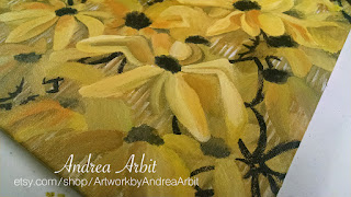

Once I had the black pattern down, I painted the yellow pattern over the top. I also added some more yellow highlights to some of the petals, to help the super-bright yellow pattern blend into the flowers a bit more.


Again, the yellow pattern isn't perfect either. But I actually prefer it that way. I spent a lot of time on the flowers themselves, working on making them look mostly dimensional (even as they piled on top of each other in an unrealistic way) - so to have the patterns be looser, less perfect, and painted much more quickly gives some contrast of texture, and makes it clear that this is a handpainted piece.
At this point, I took a break for a couple days. I wasn't sure what else needed to be done with it, so I took a breather.
When I revisited the painting, I added a bit more yellow and orange. I did another layer of yellow/orange over the parts of yellow pattern that cross the black pattern, to help mask that black pattern more. And I also added some orange into some of the petals, to make it a little less "caution" yellow, and add in some subtler yellow-orange transitions.
I'll shows those last few photos in the next post.
In the weeks since, I have finally finished this project! So this week I will be posting the last few step-by-step photos, and then several photos of the completed painting.
As I mentioned at the end of those last posts, the only thing left to do was add in the black and yellow patterns. This took a little bravery - because it was a super-contrasty, obvious part of the painting, and because it was going right on top of several of the flowers that I spent several hours perfecting. If I messed it up too much, it would not only "ruin" the rest of the painting (it would be so difficult and time-consuming to reconstruct the flowers that I liked underneath it!), but also be really obvious, because of its dark color.
I could've just left it as is (and I considered that), but my goal was always to add in the pattern eventually, and I considered the pattern a crucial part of the painting - not just for composition reasons, but for symbolic reasons. I named this painting "Finding a Proverbial Mountain" after a phrase I saw written in the journal of someone close to me, where she expressed how frustrated, upset, and angry she was. She wanted to "find a proverbial mountain and let out a proverbial scream." Without the stark chain-like pattern, it would just be a painting of a pile of overlapping Black Eyed Susans - pretty, but not exactly what I had in mind.
As it is, I don't think it really gets across much frustration or anger, but the pattern does add at least a little bit of conflict.
I knew the black pattern wouldn't look perfect, and there are parts that look a little shaky. But it's a hand-painted pattern, painted with a medium-thickness brush on canvas, so it was always going to look that way. Besides, if I wanted it to look perfect, I would've just used the digital composition I created in Illustrator/Photoshop, rather than recreating it by hand on canvas. It has a hand-made tactile quality that proves it's a unique, one-of-a-kind painting, and not something made digitally.


Once I had the black pattern down, I painted the yellow pattern over the top. I also added some more yellow highlights to some of the petals, to help the super-bright yellow pattern blend into the flowers a bit more.


Again, the yellow pattern isn't perfect either. But I actually prefer it that way. I spent a lot of time on the flowers themselves, working on making them look mostly dimensional (even as they piled on top of each other in an unrealistic way) - so to have the patterns be looser, less perfect, and painted much more quickly gives some contrast of texture, and makes it clear that this is a handpainted piece.
At this point, I took a break for a couple days. I wasn't sure what else needed to be done with it, so I took a breather.
When I revisited the painting, I added a bit more yellow and orange. I did another layer of yellow/orange over the parts of yellow pattern that cross the black pattern, to help mask that black pattern more. And I also added some orange into some of the petals, to make it a little less "caution" yellow, and add in some subtler yellow-orange transitions.
I'll shows those last few photos in the next post.
No comments:
Post a Comment