Friday, June 30, 2017

"Sexuality Bouquet (Stronger Together)" - Finished

I have six drawings planned out for this series, and finishing this latest one means I'm officially halfway done!

(If you're interested, you can check out my first 19"x25" bouquet drawing - "Race Bouquet" - at this blog post. Or the second one - "Gender Bouquet" - over here.)

The third colored pencil drawing is called "Sexuality Bouquet," and it uses a rainbow of colors to show the beautiful bouquet that is created when all people identifying as/experiencing different aspects of human sexuality are included equally. I mean for this to include people who have little or no sexual desire and those who crave it all the time, people who yearn for only physical intimacy and those who find fulfillment in emotional intimacy or long-term relationships, people experienced in a wide variety of sexual behaviors and those who are not, and of course people at all places in the LGBTQIA spectrum.

Below are some photos of the completed drawing, along with the 39 Prismacolor pencils I used. The paper is black Canson MiTeintes.


Here's a couple detail shots:


You can really see the difference in vase size looking back at these last three drawings side by side. The bouquets and vases both started getting fatter. I think I'll return to a skinnier vase for my next drawing.


This is not yet available for sale, but I will probably list it (and the others to-come in this series) in my Etsy shop at the end of the year.

-

To read about terminology related to sexuality, and why I decided to include many aspects of sexuality (and not just sexual orientation) in planning and executing this drawing, visit this blog post. To read about the idea behind this colored pencil drawing and an explanation for the symbolism of the specific flowers used, check out this one.

To see "the making of" photos of this drawing, visit these other blog posts:
  • Preliminary sketches ("In Progress 1")
  • Drawing and lightly coloring in the first 12 flowers ("In Progress 2")
  • Drawing and lightly coloring in the last 12 flowers ("In Progress 3")
  • Adding detail and dimension to the tulips, poppies, amaryllis, protea, gerbera daisies, and roses ("In Progress 4")
  • Adding detail and dimension to the zinnia, lilies, peony, gladiolus, crocus, and hydrangea ("In Progress 5")
  • Adding detail and dimension to the chrysanthemum, daffodils, freesia, sunflower, forget-me-nots, and delphinium ("In Progress 6")
  • Adding detail and dimension to the cornflower, sweet pea, anthurium, succulents, hellebore, and button poms ("In Progress 7")

Tuesday, June 27, 2017

"Sexuality Bouquet (Stronger Together)" - In Progress 7

When I say this drawing is a celebration of differences in sexuality, I'm including differences in libido, sexual behaviors, frequency, desire, willful abstinence, asexuality, sexual orientation, and relationships. For more discussion on sexuality (and definitions of related terminology), please visit this blog post.

For a description of the specific symbolism of the 24 flowers used in this drawing, check out this blog post.

-

I have only six more flowers to complete before this 19"x25" drawing is complete! First, I finished up the blue section with the last two blue flowers.

To create the cornflowers, aka bachelor buttons, I used four blue colored pencils, two shades of green, and black.


For the sweet pea, I used five shades of blue, a blue-green pencil, and three shades of green.


One more color left - the green section. I started with the anthurium, using dark green, apple green, light green, spring green, yellow-green, yellow-orange, and white and black.


This trio of succulents needed pale blue, dark green, blue-green, and two medium shades of green.

If you have a good memory, you might remember that my sketch only had two little succulents. I decided to add a third because the top sections - the red and orange especially, but the purple and yellow as well - seemed larger than the blue and green sections, and I wanted to round blue and green out a bit more. Part of the reason is perspective - since I was drawing on a surface, the red and orange were farthest from my eyes, so I probably unconsciously made them a bit bigger so they'd look the same size as the colors closer to me. But then when I held it up vertically, as it will hang on a wall, it was clear that red and orange were a bit too dominant. Another reason is that I had a rather large vase drawn at the bottom of the drawing, which smushed the blue and green sections up a bit. I decided to add a bit more succulent and hellebore to the green section, and also to add some blue and green reflections to the vase to sort of visually extend those colors, so that all six colors looked more equal.


For the hellebore, I used five shades of green, as well as a white, black, and yellow colored pencil. I also added an extra leaf jutting out to the side, to buff up the green section a bit (see comment above).


Finally, I finished with the lime green button poms, which I drew using white, yellow-green, pale green, apple green, and medium green colored pencils.


Check out my next blog post to see the finished drawing in all it's rainbow glory! I really do love the saturated colors in this drawing - they're so cherry and beautiful!

Sunday, June 25, 2017

"Sexuality Bouquet (Stronger Together)" - In Progress 6

When I say this drawing is a celebration of differences in sexuality, I'm including differences in libido, sexual behaviors, frequency, desire, willful abstinence, asexuality, sexual orientation, and relationships. For more discussion on sexuality (and definitions of related terminology), please visit this blog post.

For a description of the specific symbolism of the 24 flowers used in this drawing, check out this blog post.

-

Sometimes I wonder if I should come up with more creative blog post titles, instead of just saying "In Progress #6." But then I rationalize that I already spend too much time planning and writing these posts as it is. I could probably just post once, with photos of the finished piece, and everyone would be happy - but if there's at least one person out there who likes seeing these step-by-step pics, I guess it's worth it to show them off. :)
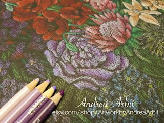
Today's post is all about the step-by-step pics of the yellow section, as well as half of the blue section.

I started with the pale yellow chrysanthemum. Yellow pencils don't always show up super well on black paper, so I put down a layer of white pencil first, and then layered the yellow on top, to make sure the yellow was nice and bright. I added some orange into the shadows, and used the black pencil to define some of the petal edges a bit better. Altogether, I used white, cream, yellow, orange, "artichoke" (which is that ugly sort of dark yellow-green pencil in the middle), two shades of green, and black.


The next yellow flowers I tackled were the daffodils. I used white, cream, yellow, orange, green, brown, and black pencils.


For the yellow freesia, I used white, cream, yellow, and yellow-orange. For the stems and leaves, "apple green."


The bright yellow sunflower needed cream, yellow, yellow-orange, orange, yellow-green, light green, and black pencils.


Once the yellow section was complete, I moved on to the blue flowers. I did this simply because I'm used to working left to right (being right handed), and I didn't want to smudge the completed flowers while I worked on the next ones.

These little pale blue forget-me-nots used two shades of light purple, two shades of light blue, a medium blue, two shades of green, and yellow and orange for the centers of the flowers.


The delphinium stalk was created with four shades of blue and a green colored pencil.


Only six more flowers to complete (plus the large, fishbowl-shaped vase at the bottom of the drawing)! My next post will cover those "in progress" photos.

Friday, June 23, 2017

"Sexuality Bouquet (Stronger Together)" - In Progress 5

When I say this drawing is a celebration of differences in sexuality, I'm including differences in libido, sexual behaviors, frequency, desire, willful abstinence, asexuality, sexual orientation, and relationships. For more discussion on sexuality (and definitions of related terminology), please visit this blog post.

For a description of the specific symbolism of the 24 flowers used in this drawing, check out this blog post.

-

It's time to look at the next six flowers in this bouquet - the second half of the orange section, and the purple section.

The next orange flowers I worked on were these zinnia plants. I used white and peach for highlights, yellow, orange-yellow, orange, and red pencils for the petals, and two shades of green for the leaves.


I rounded out the orange section with these pale orange lilies. I used white, peach, and orange pencils for the petals, and three shades of green for the leaves, and to blend into the little lily buds that hadn't opened yet.


I moved onto the purple section next, only because I'm a righty and used to working on artwork from left to right so as to avoid potential smearing or smudging. The purple section is the farthest to the left in this bouquet.

For the large purple peony, I used four shades of purple ranging from very pale lavender-gray to a darker red-violet pencil.


For the purple gladiolus, I used three shades of purple, black, and red (to help blend the purple section into the red section just a little bit). For the stems I used green and blue-green pencils.


The cute little crocuses were drawn with red-violet, black, yellow, green, and two light purple pencils.


The last purple flower was this bunch of hydrangea. Since it's adjacent to the blue section, I added some blue coloring in as well. I used pink, red-violet, purple, pale purple, light blue, dark blue, light green, and dark green colored pencils. The yellow-green pencil on the end is the one I used to add a few small leaves coming off the large peony blossom.


This second pass through of the bouquet is now half done! I've finished the red, orange, and purple sections. Next up - adding in some yellow!


Wednesday, June 21, 2017

"Sexuality Bouquet (Stronger Together)" - In Progress 4

When I say this drawing is a celebration of differences in sexuality, I'm including differences in libido, sexual behaviors, frequency, desire, willful abstinence, asexuality, sexual orientation, and relationships. For more discussion on sexuality (and definitions of related terminology), please visit this blog post.

For a description of the specific symbolism of the 24 flowers used in this drawing, check out this blog post.

-

I've finished the planning and preliminary sketches, and I've lightly drawn all the flowers on the black paper. Now it's time to really have some fun with color!

Once again, I started in the red section - this time with the red tulips in the upper left of the bouquet. I used pink for the highlights, three shades of red, and a magenta colored pencil. For the bright green stems and leaves, I used two shades of yellow-green and a light bluish-green.


Then I worked on the red poppies. One of my Prismacolor pencils is actually called "Poppy Red" so I had to use that one! I also used another shade of red, a red-violet, and black. For the stems, I used two shades of green and a pale blue for highlights.


I worked on the red amaryllis next. Because it was right next to the orange section, I threw a little orange in to these flowers to help blend it into the next part of the color wheel a bit. I used two red pencils, one orange pencil, and a pale peach for the flowers, with two green colored pencils being used for the leaves. (That contraption you see at the bottom of the orange pencil is a pencil extender. The pencil's almost gone, and it can be hard to hold the little pencil stubs and get an accurate drawing, so they make pencil extenders to fit your little stubs into so you can hold them easier.)


The final red flower is this pink-red protea. I used two red pencils, three pink pencils, white, and two shades of green.


Here's the red section! Just five more color sections to go.


The first flowers I worked on in the orange section were these two gerbera daisies. I used pink, red, orange, yellow-orange, and black colored pencils to get all the shades in these pretty petals.


Then I moved onto the orange roses. I used peach for the highlights, two shades of orange, and two shades of red for the shadows.


Those are the first six flowers complete! My next post will look at the next six flowers I drew.